Appearance
Quick buy drawer
This guide describes the Theme settings > Quick buy drawer menu options.
Use the menu options to configure your store's Quick buy drawer for supported product pages. When a store visitor selects a product, the Quick buy drawer opens as an overlay with product variants and purchase options.
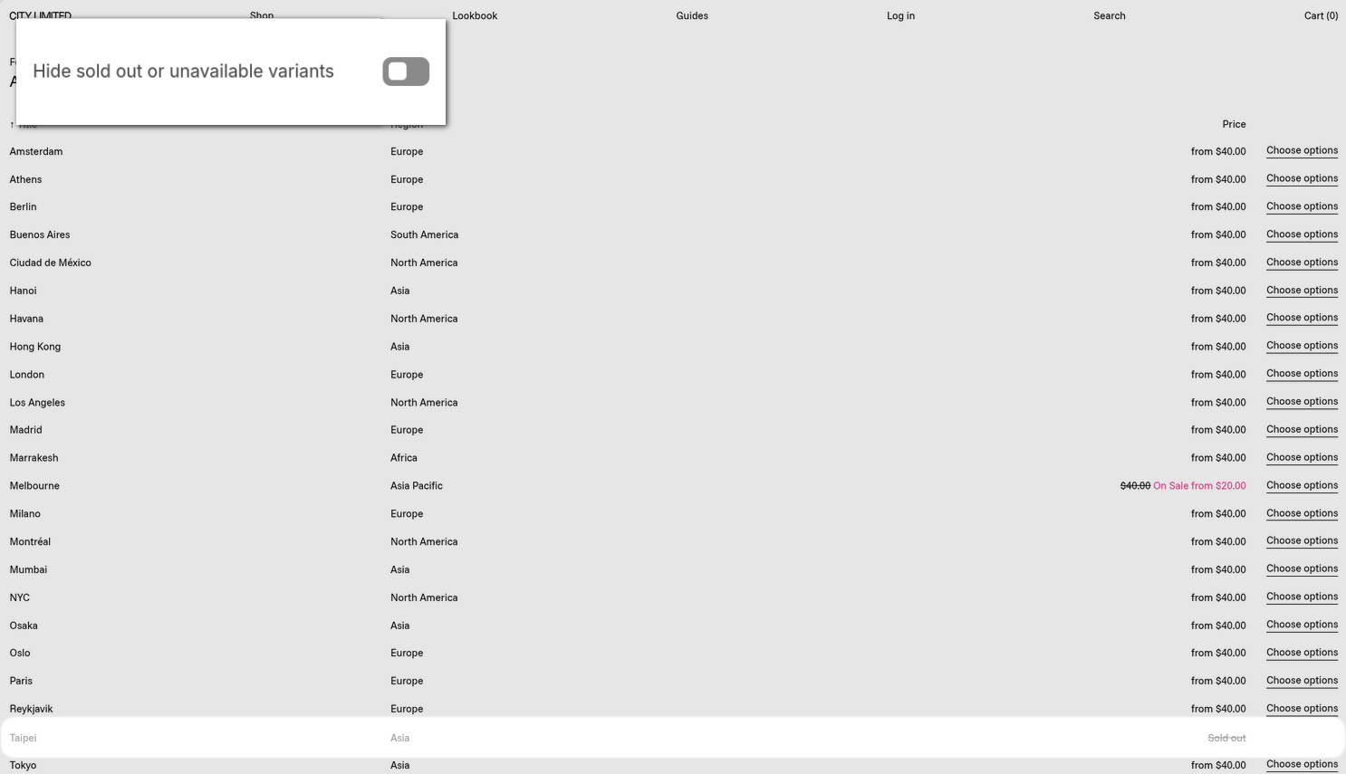
The previous image shows a Featured collection table section on a store's page. The section is configured to show the Quick buy drawer when a store visitor selects Choose options. In the upper left, part of the Theme editor's Theme settings > Quick buy drawer is displayed. The menu's Hide sold out or unavailable variants option is set to off. When this options is off, sold-out and unavailable variants are shown with strike-through text. For example, the image shows Taipei is listed as Sold out and has strike-through text applied. f you prefer to hide sold-out and unavailable variants, enable the Hide sold out or unavailable variants option.
For general guidance with adjusting a theme setting, refer to Settings overview and Shopify help: Theme settings.
Set up the quick buy drawer
To set up the quick buy drawer:
In the Theme editor, go to Theme settings > Quick buy drawer.
Select a setting described in the following table.
| Setting name | Description |
|---|---|
| Product media crop | Use the Product media crop options to select Square, Portrait, Landscape or No crop. This setting controls the aspect ratio of the product media displayed in the quick buy drawer. |
| Options style | Use the Options style options to select Text with underline, Radio, Button or Drop-down. This setting specifies the visual style for product variant selectors inside the quick buy drawer. |
| Full width buttons | Use the Full width buttons options to turn on/off "Full width buttons mode". With this setting enabled, variant buttons fill the available width of the drawer container. To use this option, set Options style to Button. |
| Spread options | Use the Spread options options to turn on/off "Spread options" mode. With this setting enabled, text-style variant options are distributed evenly across the container width. To use this option, set Options style to Text with underline. |
| Hide option labels | Use the Hide option labels options to show/hide text labels, inside the quick buy drawer, for product variant options. |
| Hide sold out or unavailable variants | Use the Hide sold out or unavailable variants options to show or hide variant options inside the quick buy drawer, for variants that are currently out of stock or not available for purchase. Note that enabling this option with the Theme settings > Products > Availability display mode option set to Adjacent might make some product option combinations unreachable. Please consider enabling only one of these two options. |
| Select the first available variant | Use the Select the first available variant options to turn on/off "First available variant" mode. When enabled, the first in-stock variant is automatically selected inside the quick buy drawer. With this setting off, adding to the cart will not be possible until each product option has a selection. |
| Product group > Options style | Use the Options style options to select Button, Swatches, Thumbnails, Text with underline, Radio or Drop-down. This setting defines the visual layout for product group selectors. To use these options, enable product groups in Theme settings > Product grid tiles. |
| Product group > Hide label | Use the Hide label options to show/hide the label text for the product group selection. To use these options, enable product groups in Theme settings > Product grid tiles. |
| Product group > Show value | Use the Show value options to show/hide the name of the selected option displayed next to swatches or thumbnails in the product group selection area. To use this option, set Options style to Swatches or Thumbnails. |
| Product group > Full width buttons | Use the Full width buttons options to turn on/off "Full width buttons mode". With this setting enabled, product group buttons span the full width. For the "Swatches" and "Thumbnails" styles, this only applies if the “Show value” option is enabled. To use this option, set Options style to Button, Swatches or Thumbnails. |
| Product group > Spread options | Use the Spread options options to turn on/off "Spread options" mode. With this setting enabled, text-style product group options are spread across the container width. To use this option, set Options style to Text with underline. |
| Discount tag > Show discount tag | Use the Show discount tag options to show/hide discount badges for products with a compare-at price. |
| Discount tag > Type | Use the Type options to select Percentage or Fixed-amount. This setting determines whether the discount is shown as a percentage off or a fixed monetary amount. To use this option, enable Show discount tag. |
| Discount tag > Use accent color | Use the Use accent color options to turn on/off applying the theme's accent color to the discount tag background. To use this option, enable Show discount tag. |
| Quantity selector > Show quantity selector | Use the Show quantity selector options to show/hide a quantity input field in the quick buy drawer. |
| Quantity selector > Style | Use the Style options to select Inline, Border or Underline. This setting controls the visual design of the quantity selector. To use this option, enable Show quantity selector. |
| Quantity selector > Full width | Use the Full width buttons options to turn on/off "Full width buttons mode". With this setting enabled, the quantity selector fills the available width. To use this option, enable Show quantity selector and set Style to Border or Underline. |
| Quantity selector > Hide label | Use the Hide label options to show/hide the text label associated with the quantity selector. To use this option, enable Show quantity selector and set Style to Border or Underline. |
| Add to cart button > Show total price | Use the Show total price options to show/hide the calculated total price on the add-to-cart button. Showing the price hides the default right arrow icon. |
| Add to cart button > Character | Use the Character options to select a separator symbol (e.g., ·, •, ↑, etc.). This setting selects the character used to separate the button text from the price. |
| Add to cart button > Repeat character | Adjust the Repeat character slider to select a value between 1 and 3 x. This setting determines how many times the separator character is repeated. |