Appearance
Typography
This guide describes the Theme settings > Typography menu options.
Use the menu options to set how text is displayed throughout your store. Refer to Shopify help: Typography.
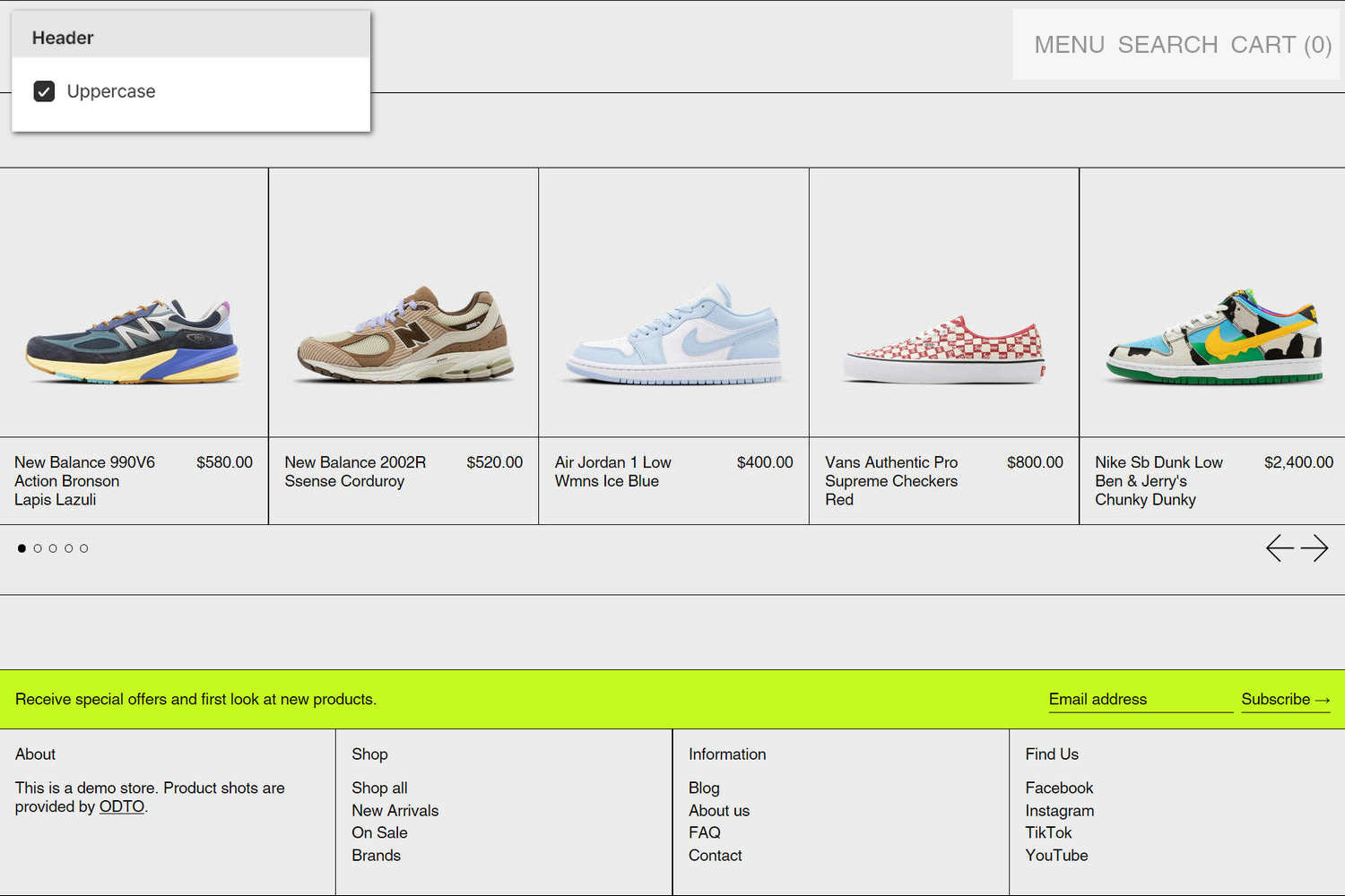
The previous image shows a store's home page. In the upper left, part of Theme editor's Theme settings > Typography menu is displayed. The menu's Header > Uppercase option is set to on. On the right, this setting uses uppercase text to display the linked items inside the Featured menu section. For example, the uppercase text is applied to the section's NEW ARRIVALS menu item.
For general guidance with adjusting a theme setting, refer to Settings overview and Shopify help: Theme settings.
Set up typography
To set how text is displayed throughout your store:
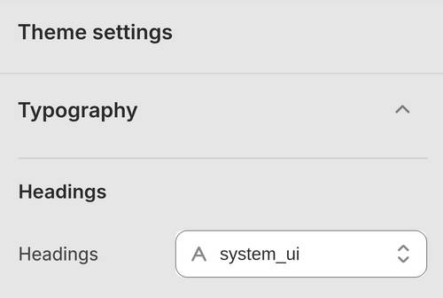
In Theme editor, go to Theme settings > Typography.
Select a setting described in the following table.
| Setting name | Description |
|---|---|
| Base font size | Adjust the Base font size slider to set a size for the base font in pixels or px. All text throughout your store is scaled relative to the base font size. The minimum size is 13 px, and the maximum is 22 px. |
| Headings > Headings | Use the Headings font picker to select a font for heading text. Refer to Set up fonts. |
| Headings > Uppercase | Select the Uppercase options to turn on/off uppercase for heading text. |
| Headings > Underline | Select the Underline options to turn on/off underline for heading text. |
| Headings > Letterspacing | Adjust the Letterspacing slider to set the spacing between headings and lines of body text. The minimum slider value is -50, and the maximum is 200. |
| Headings > Line height | Adjust the Line height slider to set the spacing between lines of text (line height). The minimum height is 0.8 and the maximum is 2. |
| Standard headings > Mobile font size scale | Adjust the Mobile font size scale slider to set a font size for standard heading text on mobile devices. Standard headings are used for section titles and main section headings. The minimum value is -2, and the maximum is 4. |
| Standard headings > Desktop font size scale | Adjust the Desktop font size scale slider to set a font size for standard heading text on desktop devices. Standard headings are used for section titles and main section headings. The minimum value is -2 and the maximum is 7. |
| Feature headings > Mobile font size scale | Adjust the Mobile font size scale slider to set a font size for feature heading text on mobile devices. Feature headings are used for product, collection, article and page templates. The minimum value is -2 and the maximum is 4. |
| Feature headings > Desktop font size scale | Adjust the Desktop font size scale slider to set a font size for feature heading text on desktop devices. Feature headings are used for product, collection, article and page templates. The minimum value is -2 and the maximum is 7. |
| Secondary headings > Mobile font size scale | Adjust the Mobile font size scale slider to set a font size for secondary heading text on mobile devices. Secondary headings are used for the blog post grid, text columns, and other secondary headings. The minimum value is -2 and the maximum is 4. |
| Secondary headings > Desktop font size scale | Adjust the Desktop font size scale slider to set a font size for secondary heading text on desktop devices. Secondary headings are used for the blog post grid, text columns, and other secondary headings. The minimum value is -2 and the maximum is 7. |
| Body text > Body text | Use the Body text font picker to select a font for body text. Refer to Set up fonts. |
| Body text > Line height | Adjust the Line height slider to set the spacing between lines of text (line height) for the body text. The minimum height is 1 and the maximum is 2. |
| Body text > Uppercase | Select the Uppercase options to turn on/off uppercase for body text. |
| Section titles > Font | Use the Font options to specify a font for section titles. Set Section title text to use the same font as Heading or Body text. |
| Section titles > Text align | Use the Text align options to align Section title text to the Left or Center. |
| Section titles > “View all” link position | Use the “View all” link position options to set the "View all" link text to display Below content or Under section title. If you select the Under section title option, you must provide heading text inside the corresponding section/block. To use this option, set the Text align option to Center. |
| Subheadings > Font | Use the Font options to specify a font for subheadings. Set subheading text to use the same font as Heading or Body text. Alternatively, select Custom to apply a custom font to subheading text. Use the Subheadings > Custom font picker to specify a custom font to apply to subheadings. |
| Subheadings > Custom font | Use the Custom font picker to select a font for subheading text. The font you choose is applied to subheading text if the Subheadings > Font option is set to Custom. Selecting a custom font can slightly impact your store’s loading speed. To learn how to upload a custom font, refer to Use a custom font. To use this setting, set the Subheadings > Font option to Custom. |
| Subheadings > Mobile font size scale | Adjust the Mobile font size scale slider to set a font size for subheading text on mobile devices. The minimum value is -2 and the maximum is 1. |
| Subheadings > Desktop font size scale | Adjust the Desktop font size scale slider to set a font size for subheadings text on desktop devices. The minimum value is -2 and the maximum is 1. |
| Subheadings > Uppercase | Select the Uppercase options to turn on/off uppercase for subheading text. |
| Subheadings > Underline | Select the Underline options to turn on/off underline for subheading text. |
| Subheadings > Letterspacing | Adjust the Letterspacing slider to set the spacing between subheadings and lines of body text. The minimum slider value is -50, and the maximum is 200. |
| Subheadings > Line height | Adjust the Line height slider to set the spacing between lines of text (line height). The minimum height is 0.8 and the maximum is 2. |
| Subheadings > Symbol | Use the Symbol options to display a Circle, Square, or Diamond text character (symbol) as a prefix for subheading text. Alternatively, select None to display subheading text without a prefix symbol. |
| Subheadings > Symbol size | Adjust the Symbol size slider between 0.5 and 1.5 ex. Use this option to specify a size for the text character (symbol) prefix for subheading text. To use this option, set the Symbol option to Circle, Square, or Diamond. |
| Subheadings > Double spacing below | Select the Double spacing below options to turn on/off displaying double spacing below subheading text. |
| Product grid > Uppercase | Select the Uppercase options to turn on/off uppercase for text inside the product grid. |
| Buttons > Font | Use the Font options to specify a font for button text. Set button text to use the same font as Heading or Body text. |
| Buttons > Mobile font size scale | Adjust the Mobile font size scale slider to set a font size for button text on mobile devices. The minimum value is -2 and the maximum is 4. |
| Buttons > Desktop font size scale | Adjust the Desktop font size scale slider to set a font size for button text on desktop devices. The minimum value is -2 and the maximum is 7. |
| Buttons > Uppercase | Select the Uppercase options to turn on/off uppercase for button (label) text. |
| Header > Font | Use the Font options to specify a font for header text. Set header text to use the same font as Heading or Body text. |
| Header > Mobile font size scale | Adjust the Mobile font size scale slider to set a font size for header text on mobile devices. The minimum value is -2 and the maximum is 1. To use this option, set the Header > Font option to Heading. |
| Header > Desktop font size scale | Adjust the Desktop font size scale slider to set a font size for header text on desktop devices. The minimum value is -2 and the maximum is 1. To use this option, set the Header > Font option to Heading. |
| Navigation > Uppercase | Select the Uppercase options to turn on/off uppercase for text related to navigation. This option applies to body font used across header and footer, navigation menus, directory/collection/blog menus, table headings, and filter/sort buttons. |
| Links > Uppercase | Select the Uppercase options to turn on/off uppercase for link text, like social media share links, subscribe links, and pagination links. |
| Links > Show underline | Select the Show underline options to turn on/off underline for link text, like social media share links, subscribe links, and pagination links. |
| Filter headings > Uppercase | Select the Uppercase options to turn on/off uppercase for filter heading text, like the heading text applied to a product filter on a collection page. |
| Filter labels and sorting options > Uppercase | Select the Uppercase options to turn on/off uppercase for filter label text and sorting options text, like the label text applied to a product filter on a collection page. |
| Badges > Font | Select the Font weight options to specify a font style for the text applied to badges. Set badges text to use the same font as Body, Heading, or Subheading text. |
| Badges > Uppercase | Select the Uppercase options to turn on/off uppercase for text applied to badges. To use this option, set the Badges > Font option to Body. |
| Badges > Font weight | Select the Font weight options to specify a font weight for the text applied to badges. Set badges text to use a Normal, Medium or Bold font weight. To use this option, set the Badges > Font option to Body. |
| Badges > Size scale | Adjust the Size scale slider between -2 and 0 to specify a size for the text applied to badges |
Set up fonts
To choose a font and font style for headings and body text:
In Theme editor, go to Theme settings > Typography.
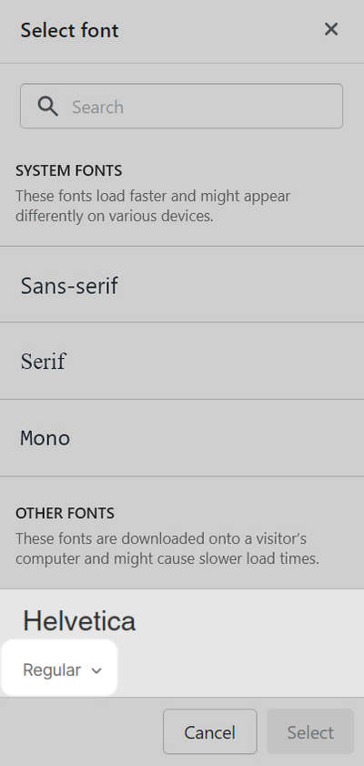
In the Typography menu, locate the type of text you want to set up, like Headings or Body text, and then select the corresponding font picker.
For example, in the following image, font picker for Headings text is selected.
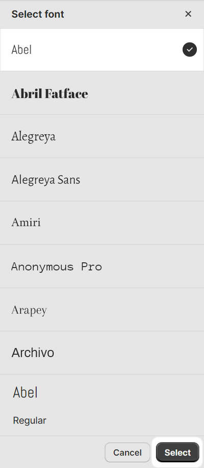
In the Search box, enter the name of a font.
Alternatively, use the font picker to select a font from the font sets described in the following table.
Font set name Description System fonts A set of default system fonts. System fonts load quickly and their appearance might change according to the visitor's device type and web browser. Refer to Shopify help: Fonts. Other fonts Fonts from Shopify's library that are not part of the default system font set. Inside the font picker area, use the dropdown to select a font style (if available).
Font styles include: Thin, Thin Italic, Extra Light, Extra Light Italic, Light, Light Italic, Regular, Italic, Medium, Medium Italic, Semi Bold, Semi Bold Italic, Bold, Bold Italic, Extra Bold, Extra Bold Italic, Black and Black Italic.
Choose Select.
At the top of the page, select Save.