Appearance
Product grid tiles
This guide describes the Theme settings > Product grid tiles menu options.
Use the settings to specify how product tiles (images) are displayed inside Baseline's grid. The grid contains the elements of your store, like product tiles and sections.
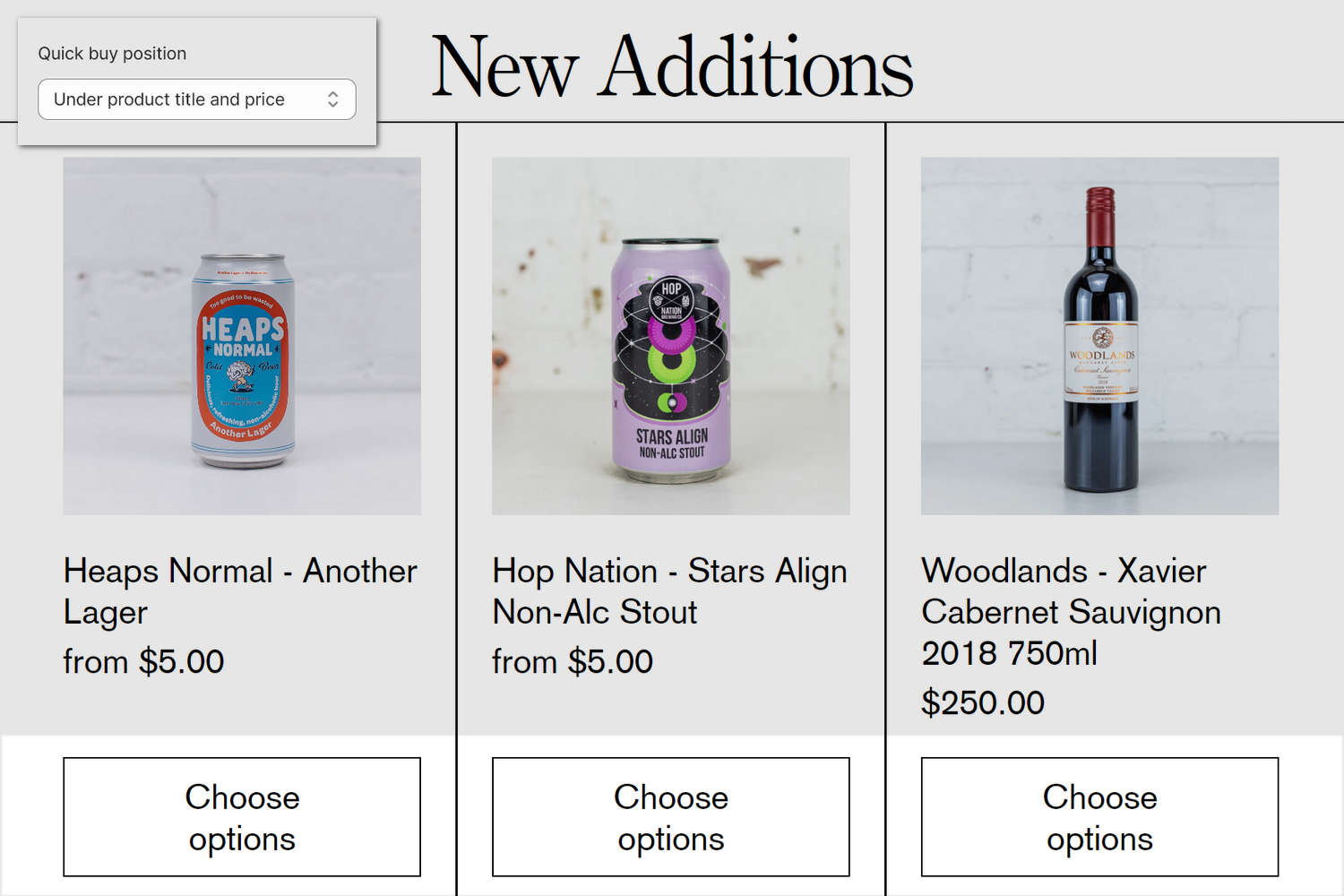
The previous image shows a collection on a store's page. On the page, product tiles display three products from the collection. In the upper left, part of Theme editor's Theme settings > Product grid tiles menu is displayed. The menu's Quick buy > Position on desktop option is set to Under product title and price. Inside the tile for each product, this option positions the Add to cart or Choose options (Quick buy) selector below the product's title text and price.
For general guidance with adjusting a theme setting, refer to Settings overview and Shopify help: Theme settings.
Set up product grid tiles
To set up product grid tiles:
In Theme editor, go to Theme settings > Product grid tiles.
Select a setting described in the following table.
| Setting name | Description |
|---|---|
| Show vendor | Use the Show vendor options to show/hide the names of product vendors inside product tiles. |
| Image shown on hover | Use the Image shown on hover to specify display a product's Second image or Last image inside product tiles. Alternatively, select None to hide product images inside product tiles. |
| Standard product tiles > Image size | Use the Image size options to specify a size for standard product tile images inside the product grid. The options are Natural, Square (1:1), Landscape (4:3), and Portrait (2:3). Standard product tiles support quick buy, color swatches and preview option values on hover. |
| Standard product tiles > Image crop style | Use the Image crop style options to specify how images should fit within standard product tiles. The options are: Fill and Fit. This option applies only when the Standard product tiles > Image size option is not set to Natural. |
| Standard product tiles > Title and price text alignment | Use the Title and price text alignment setting to specify a position for product title text and price text inside standard product tiles. The options are Title left, price right, Title left, price underneath, and Title center, price right. To apply these options to a particular Product or Collection section, in the section's settings menu, set the Product tile type option to Standard. Standard product tiles support quick buy, color swatches and preview option values on hover. |
| Standard product tiles > Preview option values on hover | Use the Preview option values on hover options to turn on/off the display of the first product option's values and availability. Enabling this option displays the values and availability of the first product option. This feature does not support touch devices, variant availability and color swatches. |
| Standard product tiles > Show strikethrough on sold out option values | Use the Show strikethrough on sold out option values options to show/hide a strikethrough (text) line on sold out product option values. This option applies applies when the Preview option values on hover option is enabled. |
| Standard product tiles > Preselect first swatch | Use the Preselect first swatch options to turn on/off the automatic selection of the first color swatch. Disable this option to show the product’s featured image first. This option applies only when color swatches are enabled on collection pages and the product has a color option. |
| Standard product tiles > Hover image when a color swatch is selected | Use the Hover image when a color swatch is selected options to specify which image to show on hover when a swatch is active. The options are: Second image, Featured image, and None. This option applies only when color swatches are enabled on collection pages and the product has a color option. |
| Quick buy > Style on desktop | Use the Style on desktop options to choose the visual style of the quick buy action. The options are: Add icon or Button with text. Quick buy is only supported in standard product tiles. |
| Quick buy > Visibility on desktop | Use the Visibility on desktop options to control when the quick buy icon is visible. The options are: On hover or Always. To use this option, set the Style on desktop option to Add icon. Quick buy is only supported in standard product tiles. |
| Quick buy > Position on desktop | Use the Position on desktop options to specify the position of the quick buy button. The options are: Over image and Under product title and price. Only applies when "Style on desktop" is set to "Button with text". Quick buy is only supported in standard product tiles. |
| Quick buy > Button style | Use the Button style options to select the color scheme for the quick buy button. The options are: Primary or Secondary. Quick buy is only supported in standard product tiles. |
| Quick buy > Product group – group metafield key | Use the Product group – group metafield key field to enter a namespace and key value to specify a product group for the Quick buy feature to use. To use this option, set up Product groups. Refer to Link related products with Product groups. Configure group picker options in Theme settings > Quick buy drawer, refer to Quick buy drawer. Quick buy is only supported in standard product tiles. |
| Quick buy > Product group – product value metafield key | Use the Product group – product value metafield key field to enter a namespace and key value to specify a product group for the Quick buy feature to use. The namespace and key you enter are used instead of product titles, when available. To use this option, set up Product groups. Refer to Link related products with Product groups. Configure group picker options in Theme settings > Quick buy drawer, refer to Quick buy drawer. Quick buy is only supported in standard product tiles. |
| Text overlay product tiles > Image size | Use the Image size options to specify a size for Text overlay product tile images inside the product grid. The options are Natural, Square (1:1), Landscape (4:3), and Portrait (2:3). Text overlay product tiles do not support quick buy, color swatches or preview option values on hover. |
| Text overlay product tiles > Image crop style | Use the Image crop style options to specify how images should fit within Text overlay product tiles. The options are: Fill and Fit. This option applies only when the Text overlay product tiles > Image size option is not set to Natural. |
| Text overlay product tiles > Product title and price display | Use the Product title and price display setting to specify a position for overlaid product title text and overlaid price text inside Text overlay product tiles. The options are "Over image, aligned bottom", "Over image, aligned top", and "Over image, on hover". To apply these options to a particular Product or Collection section, in the section's settings menu, set the Product tile type option to Text overlay. Text overlay product tiles do not support quick buy, color swatches or preview option values on hover. |
| Text overlay product tiles > Title and price text alignment | Use the Title and price text alignment options to specify the alignment of the product title and price inside Text overlay product tiles. The options are: "Title left, price right", "Title left, price underneath", and "Title center, price underneath". Text overlay product tiles do not support quick buy, color swatches or preview option values on hover. |
| Badges > Show sold out badge | Use the Show sold out badge options to show/hide "sold out" badges. The badges are displayed inside product tiles for store products that are not in stock (listed as "sold out"). |
| Badges > Show on sale badge | Use the Show on sale badge options to show/hide "on sale" badges. The badges are displayed inside product tiles for store products listed as "on sale". |
| Badges > Sale badge display | Use the Sale badge display options to specify a display style for "on sale" badges. The options are: On sale text, % or $. This option applies to products with a sale price that uses Shopify’s compare-at price. Refer to Shopify help: Setting sale prices for products. To use this option, enable the Show on sale badge option. |
| Badges > Show custom badges | Use the Show custom badges options to show/hide custom badges on product tiles. The options are: None, Tags, and Metafield. Refer to Add custom product badges. |
| Badges > Metafield namespace and key | Use the Metafield namespace and key field to enter the namespace and key of the metafield used for custom badges. Only applies when "Show custom badges" is set to "Metafield". |
| Badges > Background color | Use the Background color options to select the background color for badges. The options are: Accent, Background, Text, and Transparent. |
| Badges > Text color on transparent background | Use the Text color on transparent background options to specify the text color for badges with a transparent background. The options are: Accent, Background, and Text. Only applies when "Background color" is set to "Transparent". |
| Badges > Horizontal alignment | Use the Horizontal alignment options to specify the horizontal position of the badges within the tile. The options are: Left or Right. |
| Badges > Padding | Use the Padding options to control the amount of padding around the badge text. The options are: Small or Regular. |