Skip to content

Hero slideshow

This guide describes setting up the Hero slideshow section.

Use the section to display a series of images or videos (slides), at the top of a store page (hero), overlaid with text.
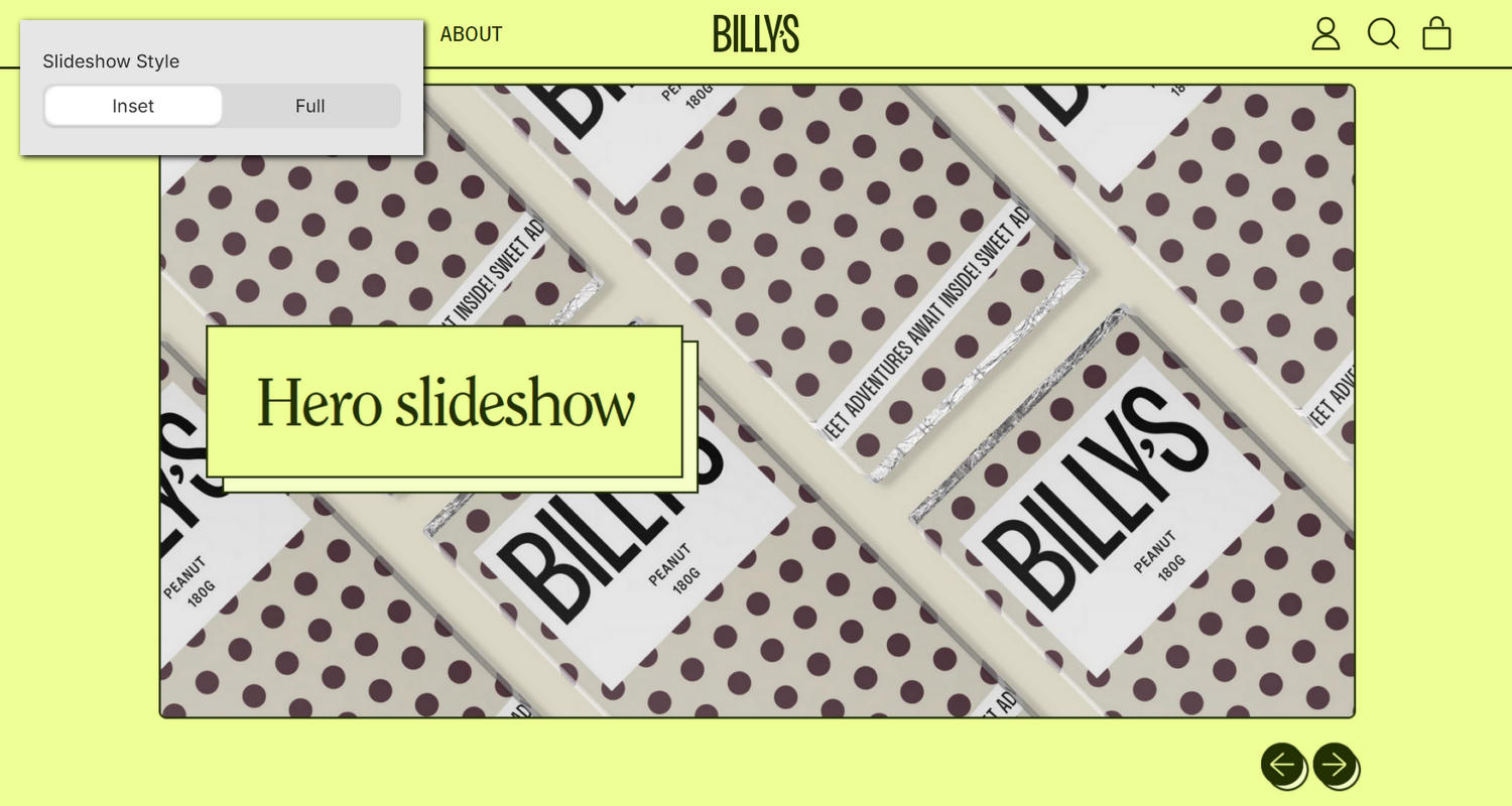
 Add videos from your store's media library or YouTube.

The previous video shows a Hero slideshow section in Theme editor, with the following settings:

  • On the left, the Hero slideshow section menu is displayed.
  • In the section's menu, to progress the series of slides automatically, the checkbox option Auto-rotate slides is set to on.
  • Note how enabling this option adds a slideshow play/pause button between the next/previous slide arrow icons.
  • On the right, the section is displayed on a store's homepage.
  • The Hero slideshow contains two Image slides (blocks).
  • Each block's button is configured to link to a store collection page.

For general guidance with modifying sections, refer to Sections overview, and Shopify help: Sections and blocks

Set up a hero slideshow section

To set up a Hero slideshow section:

  1. Go to Customize theme. At the top of the page, use the dropdown to select a template that contains a Hero slideshow section.

    Note

    The section can be added into any page, except Checkout and Giftcard pages. To add the section into the current page, select Add section > Hero slideshow. Refer to Shopify help: Add a section

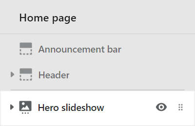
  2. From the side menu, select Hero slideshow.

    The Hero slideshow section selected in Theme editor.

  3. Select a setting described in the following table.

Setting nameDescription
Slideshow styleSelect the Slideshow style radio buttons to set the section's width to Inset or Full width.
HeightUse the Height dropdown to set the section's height. The options are:
  • Adapt to first slide
  • Screen height
  • Three quarters screen height
  • Two thirds screen height
  • Half screen height
  • 600px (pixels)
  • 700px
  • 800px
Display text overlay on cardsSelect the checkbox Display text overlay on cards to show/ hide a card behind the section's text overlay area. Refer to Shopify help: Cards
Display content below image on mobileSelect the checkbox Display content below image on mobile to display the slide's overlay text below (on) or inside (off) the slide's image area. This setting applies to mobile display devices.
Auto-rotate slidesSelect the checkbox Auto-rotate slides to turn/off automatic slideshow mode. With this option set to on the series of slides in the slideshow are progressed automatically. Enabling this option adds a slideshow play/pause button, between the next/previous slide arrow icons, inside the section, and disables dragging between slides.
Change slides everySelect the dropdown Change slides every to set a time for transitioning to the next/previous slide automatically. The options are 5 seconds, 6 seconds, 7 seconds, 8 seconds, 9 seconds, and 10 seconds.
Text overlay defaults > Content positionSelect the Content position dropdown to set a position for the text overlay area inside the section. The dropdown options are:
  • Top left
  • Top center
  • Top right
  • Middle left
  • Middle center
  • Middle right
  • Bottom left
  • Bottom center
  • Bottom right
Text overlay defaults > Text alignmentSelect the Text alignment dropdown to align text inside the text overlay area to the Left, Center, or Right.
Text overlay defaults > Heading sizeSelect the Heading size radio buttons to set the heading to use the same text size as Standard or Feature text. This setting applies to the heading inside the text overlay area.
Color > Color schemeUse the Color scheme dropdown to set the color scheme for the section to Primary, Secondary, Tertiary, or Quaternary. Refer to Colors.
Color > Use gradient for backgroundSelect the checkbox Use gradient for background to turn on/ off using a gradient as the section's background.
Theme settingsSelect Theme settings to access additional settings for the section. Refer to Section theme settings menu.
Custom CSSSelect Custom CSS. In the box, enter custom CSS styles to apply only to the current section. Refer to Shopify help: Add custom CSS. To apply custom styles to your entire online store, refer to Theme settings > Custom CSS.
Remove sectionSelect Remove section to delete the section from the current page.

Configure a block within a hero slideshow section

A default Hero slideshow section contains two slides (Slide - Image blocks). To configure a block inside the section:

  1. Go to Customize theme. At the top of the page, use the dropdown to select a template that contains a Hero slideshow section.

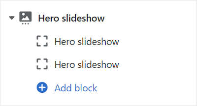
  2. From the side menu, expand the Hero slideshow section menu.

  3. To configure an existing block, select the block from the side menu.

    To add a new block, select Add block, choose a block to add, and then select the block you added.

    The Hero slideshow' add block menu in Theme editor.

    Note

    Inside a Hero slideshow section, you can add, remove, show/ hide, or move blocks. Refer to Configure blocks inside a section, and Shopify help: Sections and blocks

  4. Apply a setting described in the Table: Hero slideshow blocks.

Table: Hero slideshow blocks

The following table describes the blocks inside the Hero slideshow section, and their corresponding settings.

The blocks indicated with an asterisk * are contained in a default Hero slideshow section. To configure a block, refer to Configure a block within a Hero slideshow section.

Block nameBlock descriptionBlock setting(s)
Slide - Image *Displays an image, within a series of media (slides), overlaid with text.
  • Use the Image selector options to set up an image inside the block. Refer to Add, replace or remove an image or video inside a section or block.

  • To display an image from a dynamic source, select the Connect dynamic source icon beside the Image selector, and then choose a metafield to add. Refer to Shopify help: Metafields

  • Use the Image - mobile selector options to set up an image inside the block for mobile display devices. The recommended image dimensions are 800px x 1200px (pixels), and .jpg format. Refer to Add, replace or remove an image or video inside a section or block.

  • To display an image for mobile devices from a dynamic source, select the Connect dynamic source icon beside the Image - mobile selector, and then choose a metafield to add. Refer to Shopify help: Metafields

  • In the Title box, enter text to display as a title (heading) inside the block.

  • In the Text box, enter text to display as body text inside the block. Format the text or add a link using the Text editor pane.

  • To display text from a dynamic source, select the Insert dynamic source icon beside the Text box, and then choose a metafield to add. Refer to Shopify help: Metafields

  • In the Call to action > Link box, enter a URL for the block's button to use or select a link to a store page. The button is displayed inside the block's text overlay area. To remove a link, select the X icon inside the text box. To visit the link, select the Visit link icon above the Link box.

  • To display a links from a dynamic source, select the Connect dynamic source icon beside the Link box, and then choose a metafield to add. Refer to Shopify help: Metafields

  • In the Call to action > Button text box, enter text to display as a label for the block's button. The button is displayed inside the block's text overlay area.

  • Use the dropdown Text overlay > Content position to set a position for the text overlay area inside the block. The dropdown options are: Follow section, Top left, Top center, Top right, Middle left, Middle center, Middle right, Bottom left, Bottom center, and Bottom right.

  • Use the dropdown Text overlay > Text align to set the alignment for text inside the text overlay area to: Follow section, Left, Center, or Right.

  • Use the dropdown Text overlay > Text overlay color to set a color for the text overlay area to Follow color scheme, Black or White.

  • Select Remove block to delete the block from the current section.
Slide - YouTubeDisplays a YouTube video, within a series of media (slides), overlaid with text.
  • In the Video URL box, enter the URL for a YouTube video. The video is displayed inside the block.

  • Use the dropdown Aspect ratio – mobile to set a size for the video inside the block. This setting applies to mobile display devices, and the options are: Vertical (9:16), Standard (4:3), Widescreen (16:9), Extra wide (2.35:1) and Full screen.

  • Use the dropdown Aspect ratio – desktop to set a size for the video inside the block. This setting applies to desktop display devices, and the options are: Same as mobile, Standard (4:3), Widescreen (16:9), Extra wide (2.35:1) and Full screen.
    The Desktop aspect ratio applies only to the first slide block, and when the section's height option is set to Adapt to first slide. Otherwise, the slide adapts to the slideshow's height.

  • Use the Fallback image selector options to set up an image inside the block. The image is shown if the video does not load or play. Refer to Add, replace or remove an image or video inside a section or block

  • To display a fallback image from a dynamic source, select the Connect dynamic source icon beside the Fallback image selector, and then choose a metafield to add. Refer to Shopify help: Metafields

  • In the Title box, enter text to display as heading (title) text inside the block's text overlay area.

  • In the Text box, enter text to display as body text inside the block's text overlay area. Format the text, and/ or add links, using the Text editor pane.

  • To display (body) text from a dynamic source, select the Insert dynamic source icon beside the Text box, and then choose a metafield to add. Refer to Shopify help: Metafields

  • In the Call to action > Link box, enter a URL for the block's button to use or select a store page to link to. The button is displayed inside the block's text area. To remove a link, select the X icon inside the text box. To visit the link, select the Visit link icon above the Link box.

  • To display a button link from a dynamic source, select the Connect dynamic source icon beside the Link box, and then choose a metafield to add. Refer to Shopify help: Metafields

  • In the Call to action > Button text box, enter text to display as a label for the block's button. The button is displayed inside the block's text area.

  • Select the Text overlay > Content position dropdown to position the blocks's text overlay area. The dropdown options are: Follow section, Top left, Top center, Top right, Middle left, Middle center, Middle right, Bottom left, Bottom center, and Bottom right.

  • Select the Text overlay > Text align dropdown to align text inside the text overlay area. The options are Follow section, Left, Center, and Right.

  • Use the dropdown Text overlay > Text overlay color to set a color for the text overlay area to Follow color scheme, Black or White.

  • Select Remove block to delete the block from the section.
Slide - VideoDisplays a video from your store's media library, within a series of media (slides), overlaid with text.
  • Use the Video selector options to set up a video from your store's media library inside the block. Refer to Add, replace or remove an image or video inside a section or block.

  • Use the Crop dropdown to set a size for the video inside the block. The dropdown options are: Natural, Vertical (9:16), Standard (4:3), Widescreen (16:9), Extra wide (2.35:1) and Full screen. The Natural option uses the video's intrinsic aspect ratio.

  • Use the dropdown Aspect ratio – desktop to set a size for the video inside the block. This setting applies to desktop display devices, and the options are: Same as mobile, Natural, Standard (4:3), Widescreen (16:9), Extra wide (2.35:1) and Full screen. The Natural option uses the video's intrinsic aspect ratio.
    The Desktop aspect ratio applies only to the first slide block, and when the section's height option is set to Adapt to first slide. Otherwise, the slide adapts to the slideshow's height.

  • In the Title box, enter text to display as heading (title) text inside the block's text overlay area.

  • In the Text box, enter text to display as body text inside the block's text overlay area. Format the text, and/ or add links, using the Text editor pane.

  • To display (body) text from a dynamic source, select the Insert dynamic source icon beside the Text box, and then choose a metafield to add. Refer to Shopify help: Metafields

  • In the Call to action > Link box, enter a URL for the block's button to use or select a store page to link to. The button is displayed inside the block's text area. To remove a link, select the X icon inside the text box. To visit the link, select the Visit link icon above the Link box.

  • To display a button link from a dynamic source, select the Connect dynamic source icon beside the Link box, and then choose a metafield to add. Refer to Shopify help: Metafields

  • In the Call to action > Button text box, enter text to display as a label for the block's button. The button is displayed inside the block's text area.

  • Select the Text overlay > Content position dropdown to position the blocks's text overlay area. The dropdown options are: Follow section, Top left, Top center, Top right, Middle left, Middle center, Middle right, Bottom left, Bottom center, and Bottom right.

  • Select the Text overlay > Text align dropdown to align text inside the text overlay area. The options are Follow section, Left, Center, and Right.

  • Use the dropdown Text overlay > Text overlay color to set a color for the text overlay area to Follow color scheme, Black or White.

  • Select Remove block to delete the block from the section.
StickerOverlays the section with a stylized sticker.Refer to Stickers.
Shape dividerDisplays a stylized separator between the current section and the next/ previous section.Refer to Shape divider.