Appearance
Collection image
This guide describes the Collection image section.
Use the section to display an image above a collection on a collection page. The section displays your collection's featured image. Refer to Shopify help: Add or change the featured image for a collection.

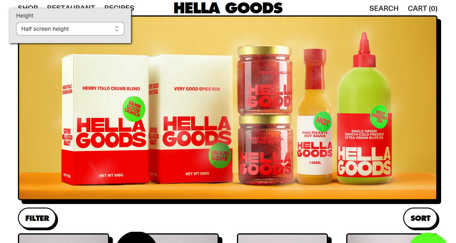
The previous image shows an example store's Collection page. In the upper left, part of Theme editor's Collection image section menu is displayed. The menu's Height option is set to Half screen height. This option specifies a height for the (collection) image inside the section. For example, in the previous image, the section's image is displayed at half screen height.
For general guidance with modifying sections, refer to Sections overview, and Shopify help: Sections and blocks.
Configure the Collection image section
To configure your Collection image section:
Go to Customize theme.
In Theme editor, at the top of the page, use the dropdown to select Collections > Default collection.
Note
The section is available only on the Collections > Default collection page template.
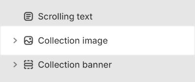
From the side menu, select Collection image.

Select a setting described in the following table.
| Setting name | Description |
|---|---|
| Style | Use the Style options to select Full or Inset. Use this option to specify a display style for the section's media (image). |
| Height | Use the Height options to select Natural, Screen height, Three quarters screen height, Two thirds screen height, Half screen height, 600px, 700px or 800px. Use this option to specify a height for the section's media (image). |
| Color > Color scheme | Use the Color scheme picker to select a color scheme for the section. Refer to Colors. |
| Color > Theme settings (link) | Follow the Theme settings link to open Theme editor's Color theme settings. Use the settings to edit the theme colors for your entire store. |
| Color > Use gradient for background | Set the Use gradient for background checkbox to on or off. Use this option to turn on/off using a gradient as the section's background. |
| Theme settings | If available, select Theme settings to access additional settings for the section. Refer to Section theme settings menu. |
| Custom CSS | Select Custom CSS. In the box, enter custom CSS styles to apply only to the current section. Refer to Shopify help: Add custom CSS. To apply custom styles to your entire online store, refer to Theme settings > Custom CSS. |
Configure a block within a Collection image section
To configure a block for your Collection image section:
Go to Customize theme.
In Theme editor, at the top of the page, use the dropdown to select Collections > Default collection.
From the side menu, expand the Collection image section menu.
To configure an existing block, select the block from the side menu.
To add a new block, select Add block, choose a block to add, and then select the block you added.

Note
Inside the section, you can add, remove, show, hide, and move blocks. Refer to Configure blocks inside a section, and Shopify help: Sections and blocks.
Apply a block setting described in the following table.
| Block name | Block description | Block setting(s) |
|---|---|---|
| Background pattern | Displays a stylistic pattern as a background inside the section. | Refer to Background pattern. |
| Background shape | Displays a stylistic shape as a background inside the section. | Refer to Background shape. |
| Sticker | Overlays the section with a stylized sticker. | Refer to Stickers. |
| Shape divider | Displays a stylized separator between the current section and the next/previous section. | Refer to Shape divider. |