

Appearance
Call to action sticker
This guide describes how to set up the Call to action sticker section.
Use the section to overlay a store page with a sticker that links to an (optional) URL, such as a store collection page.
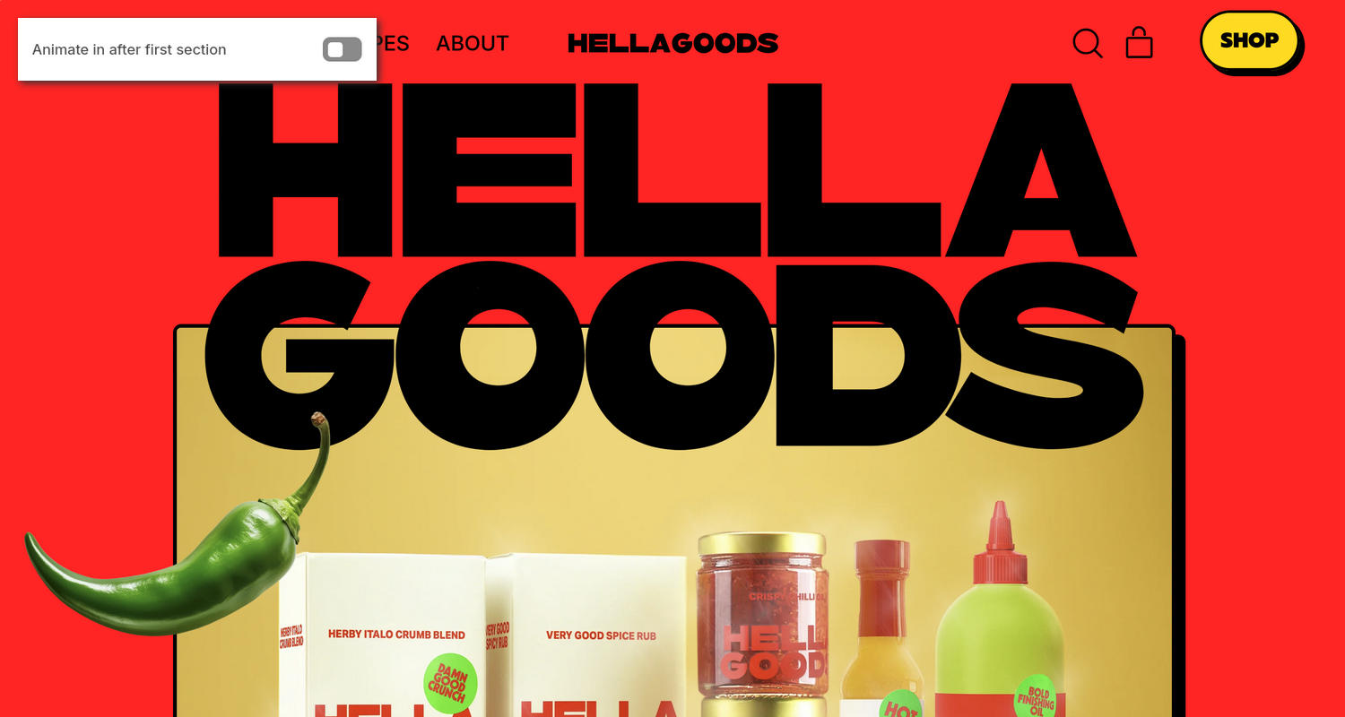
The previous image shows a store's home page. In the upper left, part of the Theme editor's Call to action sticker section menu is displayed. The menu's Animate in after first section option is turned off. This option turns on and off applying a transition animation to the section's sticker. With this option on, when a store visitor moves the page downwards, the animation displays the sticker after the visitor scrolls past the page's first section. With this option off, the sticker overlays every section on the page as the store visitor moves the page downward. In the previous image, the sticker is the green chilli pepper in the lower left.
For general guidance with modifying sections, refer to Sections overview and Shopify help: Sections and blocks.
Configure the Call to action sticker section
To configure your Call to action sticker section:
In the Theme editor, at the top of the page, use the dropdown to select the Home page.
Note
The section is accessible from all pages, excluding the Checkout, Gift card, and Password pages.
From the side menu, select Call to action sticker.
Select a setting described in the following table.
| Setting name | Description |
|---|---|
| Home page only | Use the Home page only option to turn on or off displaying the section only on the home page. |
| Animate in after first section | Use the Animate in after first section option to turn on or off a transition animation that displays the section's sticker after a store visitor scrolls past the first section on the page. |
| Hide when scrolling up | Use the Hide when scrolling up option to show or hide the section's sticker when a store visitor scrolls up the page. |
| Text | In the Text field, enter text to display in the section. |
| Link | In the Link field, enter an external URL or select a store page. With a link set, the sticker is hyperlinked. |
| Shape | Use the Shape options to select a shape. For example, select Ellipse, Rounded nonagon, or Pixelated. Selecting some shapes will crop the image. The shape you select is applied to the section's sticker. For a list of available shapes, refer to Stickers. |
| Width | Adjust the Width slider between 100 and 200 pixels to specify a width for the section. |
| Half width on mobile | Use the Half width on mobile option to turn on or off displaying the section at half width on mobile display devices. |
| Position | Use the Position options to position the section on the Left or Right of the page. |
| Font size | Use the Font size options to select Extra small, Small, Medium, Large, or Extra large to specify a size for the section's text. The font size is scaled relative to the sticker's Width. For best results, apply this setting after you set the section's Text and Shape. |
| Custom image > Image | Use the Image picker to select an image to display in the section. The image is displayed instead of the section's text. Refer to Add, replace or remove an image or video inside a section or block. |
| Position > Rotate | Adjust the Rotate slider between -90 and 90 degrees to rotate the section on a page. |
| Position > Enable rotation animation | Use the Enable rotation animation option to show or hide an animation that rotates the section automatically. |
| Mobile > Show on mobile | Use the Show on mobile option to show or hide the section on mobile display devices. |
| Color > Color scheme | Use the Color scheme picker to select a color scheme for the section. Refer to Colors. |
| Color > Background color | Use the Background color options to select Text, Accent 1, Accent 2, Card, Background, or Gradient to specify a color for the section's background. |
| Theme settings | If available, select Theme settings to access additional settings for the section. Refer to Section theme settings menu. |
| Custom CSS | Select Custom CSS. In the CSS field, enter custom CSS styles to apply only to the current section. Refer to Shopify help: Add custom CSS. To apply custom styles to your entire online store, refer to Theme settings > Custom CSS. |
| Remove section | Select Remove section to delete the section from the current page. |
Note
To connect a metafield to a setting that supports metafields, select the Connect dynamic source icon displayed beside the setting in the Theme editor.
To learn how to connect a metafield to a supported setting, refer to Shopify help: Connecting metafields to your theme by using the Theme editor.