

Appearance
Featured product
This guide describes how to set up the Featured product section.
Use the section to display a specific product on a store page.
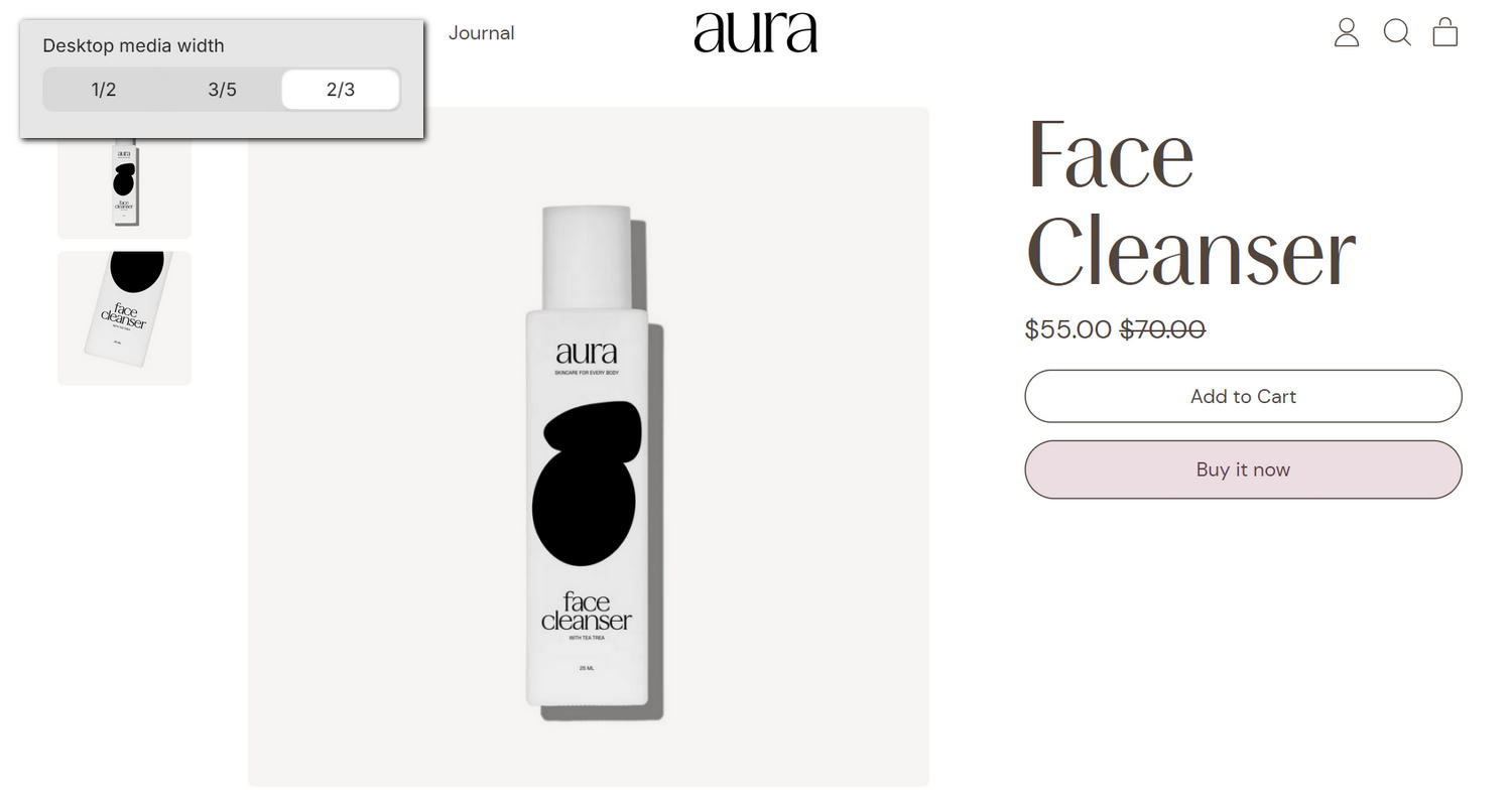
The previous image shows an example store's home page. In the upper left, part of the Theme editor's Featured product section menu is displayed. The menu's Media > Desktop width option is set to 2/3. This option specifies a width for media in the section on desktop display devices. For example, in the previous image, the face cleanser product's media occupies two thirds of the section's width.
For general guidance with modifying sections, refer to Sections overview and Shopify help: Sections and blocks.
Configure the Featured product section
To configure your Featured product section:
In the Theme editor, at the top of the page, use the dropdown to select a page that contains a Featured product section.
Note
The section can be added to any page, except Gift card and Customer pages. To add the section to the current page, select Add section > Featured product. Refer to Shopify help: Add a section.
From the side menu, select Featured product.
Select a setting described in the following table.
| Setting name | Description |
|---|---|
| Featured product | Use the Featured product picker to select a product to display in the section. Refer to Shopify help: Products. |
| Media > Shape | Use the Shape options to select a shape for images in the section. For example, select Default, Ellipse, Rounded nonagon, or Pixelated. Shapes theme offers more than 70 shapes in categories such as Fit to image, Basic, Polygons, Stars, Scalloped circles, Square, Miscellaneous, and Variable. Note that this option does not apply to videos or models and some shapes will crop the image. Refer to Style images and videos with shapes. |
| Media > Crop | Use the Crop options to set the cropping style for media in the section to No crop, Landscape, Square, or Portrait. This option is displayed when the Shape option is set to a "Fit to image" shape such as Default, Ellipse, Pill, or Archway. Refer to Style images and videos with shapes. |
| Media > Enable image zoom | Use the Enable image zoom option to show or hide a panel containing product media in the section. The panel opens when a product's media item is selected inside the section. The panel provides a zoom in and out feature for product media, arrow icons for navigating between items, and an X icon to close the panel. |
| Media > Enable video looping | Use the Enable video looping option to turn on or off continuous replay for videos in the section. If this setting is set to off, the video plays once. Using this setting requires uploading video media to the Products area of your Shopify admin. Refer to Shopify help: Product media. |
| Media > Autoplay videos on desktop | Use the Autoplay videos on desktop to turn on or off playing videos automatically, in the section. This setting applies to desktop displays. Note that videos are muted and this feature does not support YouTube or Vimeo. |
| Media > Mobile width | Use the Mobile width options to select Full or 4/5. Use this option to set a width for media in the section on mobile display devices. |
| Media > Desktop width | Use the Desktop width options to select 1/2, 3/5, or 2/3. Use this option to set a width for media in the section on desktop display devices. |
| Media > Show slideshow arrows on desktop | For products with multiple images or videos, use the Show slideshow arrows on desktop option to show or hide the arrow icons that move to the next or previous media item in the slideshow (media gallery). This setting applies to desktop display devices. |
| Thumbnails > Shape | Use the Shape options to select a shape for thumbnails in the section. For example, select Default, Ellipse, Rounded nonagon, or Pixelated. Shapes theme offers more than 70 shapes in categories such as Fit to image, Basic, Polygons, Stars, Scalloped circles, Square, Miscellaneous, and Variable. Refer to Style images and videos with shapes. Selecting some shapes will crop the image. |
| Thumbnails > Crop | Use the Crop options to select No crop, Landscape, Square, or Portrait. Use this option to set a cropping style for thumbnails in the section. This option is displayed when the Shape option is set to a "Fit to image" shape such as Default, Ellipse, Pill, or Archway. Refer to Style images and videos with shapes. |
| Thumbnails > Size | Use the Size options to select Standard or Large. Use this option to set a size for thumbnails in the section. |
| Thumbnails > Hide media shadow | Use the Hide media shadow option to show or hide a shadow effect for thumbnails in the section. |
| Thumbnails - Mobile > Show thumbnails | Use the Show thumbnails option to show or hide thumbnails on mobile display devices. |
| Thumbnails - Mobile > Layout | Use the Layout option to apply a Grid or Carousel layout to thumbnails on mobile display devices. To use this option, enable the Show thumbnails option. |
| Thumbnails - Desktop > Position | Use the Position options to select Under or Left. Use this option to set a position for thumbnails in the section on desktop display devices. The position is set relative to the featured image. |
| Thumbnails - Desktop > Layout | Use the Layout option to apply a Grid or Carousel layout to thumbnails on desktop display devices. To use this option, set the Position option to Under. |
| Product form area > Display on card | Use the Display on card option to show or hide a card behind the section's product form area. Refer to Shopify help: Cards. Note that enabling this option will disable the "Display on card" setting on blocks. |
| Product form area > Max width of content | Use the Max width of content option to set the maximum width for content in the section's product form area to Max, Wide, or Narrow. |
| Variants > Select the first available variant | Use the Select the first available variant option to turn on or off "First available variant" mode. When enabled, the first in-stock variant is automatically selected in the section. With this setting off, adding to the cart will not be possible until each product option has a selection. |
| Header > Title | In the Title field, enter text to display as the section's heading. Format the text and add links using the inline editor. |
| Header > Subheading | In the Subheading field, enter text to display as the section's subheading. Format the text and add links using the inline editor. To use this option, enter text in the Title field. |
| Color > Color scheme | Use the Color scheme picker to select a color scheme for the section. Refer to Colors. |
| Color > Use gradient for background | Use the Use gradient for background option to turn on or off using a gradient as the section's background. |
| Theme settings | If available, select Theme settings to access additional settings for the section. Refer to Section theme settings menu. |
| Custom CSS | Select Custom CSS. In the CSS field, enter custom CSS styles to apply only to the current section. Refer to Shopify help: Add custom CSS. To apply custom styles to your entire online store, refer to Theme settings > Custom CSS. |
| Remove section | Select Remove section to delete the section from the current page. |
Note
To connect a metafield to a setting that supports metafields, select the Connect dynamic source icon displayed beside the setting in the Theme editor.
To learn how to connect a metafield to a supported setting, refer to Shopify help: Connecting metafields to your theme by using the Theme editor.
Configure a block within a Featured product section
To configure a block for your Featured product section:
In the Theme editor, at the top of the page, use the dropdown to select a page that contains a Featured product section.
From the side menu, expand the Featured product section menu.
To configure an existing block, select the block from the side menu.
To add a new block, select Add block, choose a block to add, and then select the block you added.
Note
Inside the section, you can add, remove, show, hide, and move blocks. Refer to Configure blocks inside a section and Shopify help: Sections and blocks.
Apply a block setting described in the following table.
| Block name | Block description | Block setting(s) |
|---|---|---|
Title * | Displays a product's title inside the section. |
|
Price * | Displays a product's price inside the section. |
|
Variant picker * | Displays a variant picker for choosing variations of a product, inside the section. |
|
Buy buttons * | Displays the Add to cart and Buy it now buttons inside the section. |
|
| Quantity selector | Displays a quantity selector, inside the section, for choosing the number of products to purchase. |
|
| Product group | Displays a customizable product picker inside the section for selecting sibling products from within a product group. |
|
| Vendor | Displays the name of a product's vendor inside the section. |
|
| Star rating | Displays customer submitted product ratings, represented as star icons, inside the section. |
|
| Description | Displays a text area to contain additional product information, inside the section. |
|
| Rich text | Displays an area of formatted text inside the section. |
|
| Text | Displays a text area to contain additional product information, inside the section. |
|
| Icon row | Displays a list of items with icons, inside the section, arranged in a horizontal row. |
|
| Image row | Displays a list of items with images, inside the section, arranged in a horizontal row. |
|
| Inventory status | Displays a text indicator of a product's availability, inside the section. Note that inventory status is only shown for variants whose inventory is tracked in your Shopify admin. |
|
| Pop-up | Displays a pop-up overlay to contain additional product information, inside the section. |
|
| Liquid | Displays advanced customizations from Liquid code, like app snippets, inside the section. |
|
| Collapsible tab | Displays a text area with expandable tabs, to contain additional product information, inside the section. |
|
| Share buttons | Displays an area, inside the section, with buttons for sharing links to your store's products via social media. Refer to Social media. |
|
| Nutritional information | Displays formatted nutritional information inside the section. | Refer to Show nutritional information on product pages. |
| Horizontal bar chart | Displays a bar chart inside the section to illustrate a product feature. | Refer to Add bar charts to product pages. |
| Comparative scale | Displays a scale inside the section to illustrate relationships between product features. | Refer to Add comparative scales to product pages. |
| Complementary products | When a customer selects a product from your store, related products are displayed inside the section. To set up complementary products, install the Shopify search & discovery app, and refer to Shopify developer help: Product recommendations. |
|
| Tags | Displays product tags associated with the section's featured product. |
|
| Features list | Displays details about a product's features inside the section, using a table layout. |
|
| Dot rating | Displays a product rating scale graphic, with "dots" as rating markers. |
|
| Tabs | Displays a row of body text below a selectable heading inside the section. |
|
| Information list | Displays additional product information inside the section, using a list layout. |
|
| Spacer | Displays an area of empty (white) space inside the section. | Adjust the Height slider between 0.5 and 10 times (x). Use this option to display more or less empty (white) space in the block. |
| Background pattern | Displays a stylistic pattern as a background inside the section. | Refer to Background pattern. |
| Background shape | Displays a stylistic shape as a background inside the section. | Refer to Background shape. |
| Sticker | Overlays the section with a stylized sticker. | Refer to Stickers. |
| Shape divider | Displays a stylized separator between the current section and the next/previous section. | Refer to Shape divider. |