

Appearance
Breadcrumbs
This guide describes how to set up the Breadcrumbs section.
Breadcrumbs show your store's visitors how the current store page is positioned within your store's overall page structure. Store visitors use breadcrumbs to navigate your store's pages.
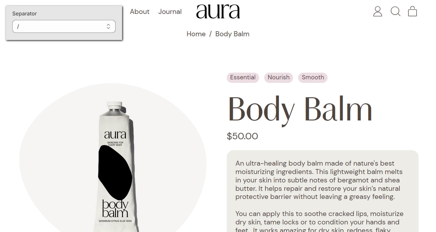
The previous image shows an example store's Product page. In the upper left, part of the Theme editor's Breadcrumbs section menu is displayed. The menu's Separator option is set to the forward slash or "/" character. This option specifies the separator character to display in the section. For example, in the previous image, the Home / Body Balm breadcrumb contains the "/" separator character.
For general guidance with modifying sections, refer to Sections overview and Shopify help: Sections and blocks
Configure the Breadcrumbs section
To configure your Breadcrumbs section:
In the Theme editor, at the top of the page, use the dropdown to select a store page that contains a Breadcrumbs section.
Note
You can add the section to the:
- Header, Footer, and Overlay areas of any page excluding the Checkout, Gift card, and Password page.
- Template area of any page excluding the 404, Cart, Checkout, Collection list, Gift card, and home page.
Breadcrumbs do not display on the home page.
From the side menu, select Breadcrumbs.
Select a setting described in the following table.
| Setting name | Description |
|---|---|
| Separator | Use the Separator options to specify a separator character to display in the section. In the example "Pages / Contact", the separator character is a forward slash or "/". The options include various slash, dash, dot, bar, and arrow characters. |
| Text alignment | Use the Text alignment options to align the section's text to the Left, Center, or Right. Use this option to control the alignment of text in the section. |
| Font size | Use the Font size options to specify a size for text in the section. Set the section's text to use the same font size as Base text. Alternatively, set the text size to Small. |
| Active text color | Use the Active text color options to specify a color for the section's active text. You can apply the Text, Accent 1, or Accent 2 color from the section's color scheme to the section's active text. Active text refers to the lowest level in the breadcrumb text. In the example "Pages / Contact", the active text is "Contact". |
| Color > Color scheme | Use the Color scheme picker to select a color scheme for the section. Refer to Colors. |
| Custom CSS | Select Custom CSS. In the CSS field, enter custom CSS styles to apply only to the current section. Refer to Shopify help: Add custom CSS. To apply custom styles to your entire online store, refer to Theme settings > Custom CSS. |
| Remove section | Select Remove section to delete the section from the current page. |