Appearance
Background shape
This guide describes the Background shape block that's included in some of the Shapes theme sections. Use the block to add a stylistic shape to a section.
The previous video demonstrates adding a Background shape to a section.
Add a background shape
You can add Background shape blocks inside any appropriate section.
For example, in the following image, a Rich text section contains a Background shape block.

To add a Background shape block to a section:
In Theme editor, select an appropriate section from the side menu.
Note
Background shape blocks can be added into most sections. But Background shape blocks cannot be added to all sections.
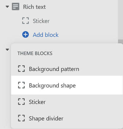
Select Add block, and then choose Background shape (block).
For example, in the following image, a Background shape block is added to a Rich text section.

Types of background shapes and blobs
Shapes theme provides the following for use with a Background shapes block:
- 70 types of background shape
- 10 blob-types. Select a blob type by adjusting the block setting's Blob type slider.
For a list of available background shapes and blob types, refer to Background shapes.
Configure a background shape
To configure a Background shape block:
In Theme editor, from the side menu, select a section that contains a Background shape block.
Expand the section menu, and then select a Background shape block.
Apply a block setting described in the following table.
| Block setting name | Description |
|---|---|
| Shape | Use the Shape dropdown to set a shape for the block to use. |
| Blob type | Adjust the Blob type slider to select the type of blob for the block to use. |
| Size | Adjust the Size slider to set a size for the shape. Background shapes that overflow the size of the section are cropped - this is a fun way to create interesting effects! The slider ranges from 25 to 300. |
| Opacity | Adjust the Opacity slider to set the visibility of the block. The slider ranges from 0 to 100 percent. |
| Blur | Adjust the Blur slider to set the intensity of the blur effect applied to the block. The slider ranges from 0 to 500. A higher value applies more blur to the shape, and creates a gradient-type effect. |
| Position > Horizontal position | Adjust the Horizontal position slider to position the block along the x-axis inside the section. The slider ranges from 0 to 100. |
| Position > Vertical position | Adjust the Vertical position slider to position the block along the y-axis inside the section. The slider ranges from 0 to 100. |
| Position > Rotate | Adjust the Rotate slider to rotate the block inside the section. The slider ranges from -90 to 90 degrees. |
| Animation > Enable parallax | Select the checkbox Enable parallax to turn on/ off a parallax animation effect. If enabled, the block's content scrolls slower than the rest of the page. |
| Animation > Parallax speed | Adjust the Parallax speed slider to set a speed for the parallax animation (if enabled). The slider ranges from 1 to 10. |
| Color > Color scheme | Use the Color scheme selector to select a color scheme for the block. Refer to Colors. |
| Color > Theme settings (link) | Follow the Theme settings link to open Theme editor's Color theme settings. Use the settings to edit the theme colors for your entire store. |
| Color > Background color | Select the Background color dropdown to set a color for the block's background. Set the block to use the section color scheme's Text, Accent 1, Accent 2, Card, Background or Gradient color. |
| Remove block | Select Remove block to delete the block from the section. |