

Appearance
Header
This guide describes how to set up the Header section.
Use the section to provide visitors with a menu for navigating the pages in your store. The header section is typically displayed across the top of store pages.
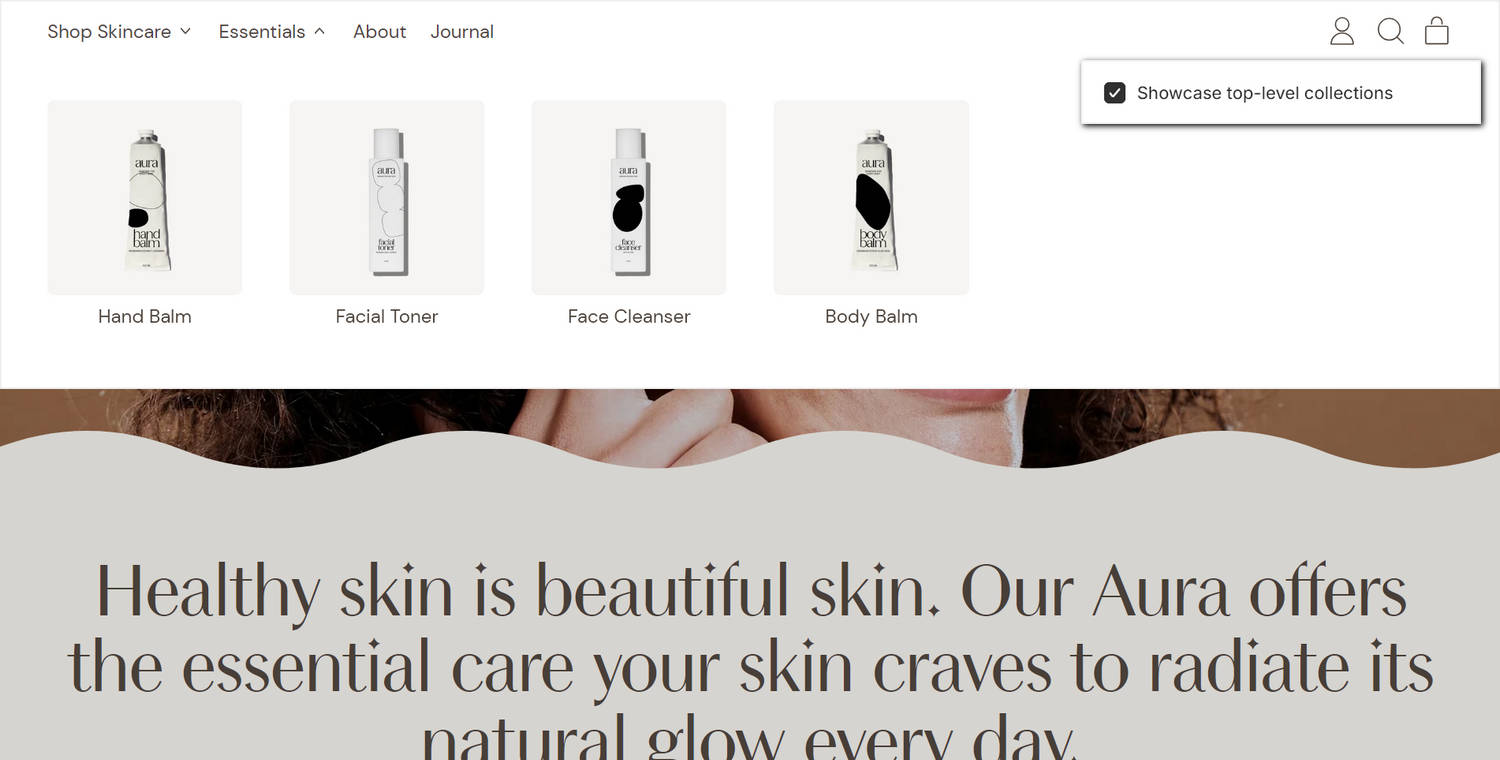
The previous image shows a Header section at the top of a store's home page. In the upper right, part of the Theme editor's Header section menu is displayed. The menu's Showcase top-level collections option is enabled. This option shows or hides links to top-level collections in the section. In the previous image, the store's top-level Essentials collection is selected in the Header section. Each product in the store's Essentials collection is represented by a collection image tile in the section's expanded mega menu area. Refer to Feature collections in navigation.
For general guidance with modifying sections, refer to Sections overview and Shopify help: Sections and blocks.
Configure the Header section
To configure your Header section:
In the Theme editor, at the top of the page, use the dropdown to select the Home page.
Note
The section is accessible from all pages, excluding the Checkout, Gift card, and Password pages.
From the side menu, select Header.
Select a setting described in the following table.
| Setting name | Description |
|---|---|
| Logo > Logo max width | Adjust the Logo max width slider between 20 and 400 pixels. Use the option to specify a size for the logo image in the section. You can set up a logo in Theme settings > Logo. Refer to Add, replace or remove an image or video inside a section or block. |
| Menu > Main menu | Use the Main menu picker to select a menu to display in the section. This option applies to desktop display devices. Refer to Set a header menu. |
| Menu > Nested navigation style on desktop | Use the Nested navigation style on desktop options to select Mega menu or Dropdown. Use this option to specify a style for displaying the nested navigation area in the section. This option applies to desktop displays. |
| Mega menu > Showcase top-level collections | Use the Showcase top-level collections option to show or hide links to top-level collections in the section. With this setting enabled, the section displays top-level links to collections. If enabled, top-level links to collections with no child links will showcase products in a mega menu. This setting does not apply to drawer navigation. To use this option, set Nested navigation style on desktop to Mega menu. Refer to Feature collections in navigation. |
| Mega menu > Enable links to child links | Use the Enable links to child links option to show or hide links to child links in the section. This setting only applies to child links that have grandchild links. To use this option, set Nested navigation style on desktop to Mega menu. |
| Mega menu > Showcase child links | Use the Showcase child links option to show or hide child links in the section. With this setting enabled, the section showcases child links to products or collections if they do not have grandchild links. To use this option, set Nested navigation style on desktop to Mega menu. |
| Mega menu > Crop feature link images | Use the Crop feature link images option to select No crop, Landscape, Square, or Portrait. Use this option to specify a cropping style for feature link images in the section. To use this option, set Nested navigation style on desktop to Mega menu. |
| Layout > Mobile layout | Use the Mobile layout options to select Logo center, menu button left or Logo left, menu button right. For mobile display devices, use this option to specify a position for the logo and menu buttons in the section. |
| Layout > Desktop layout | Use the Desktop layout options to select Logo center, menu button left, Logo center, navigation left, or Logo left, navigation center. For desktop devices, use this option to specify a position for the logo and menu items inside the section. |
| Layout > Show search | Use the Show search option to show or hide the search feature in the section. |
| Layout > Sticky header | Use the Sticky header option to turn on or off keeping the header at the top of the page. |
| Layout > Show icons | Use the Show icons option to show or hide the Search and Cart icons in the section. |
| Layout > Cart icon | Use the Cart icon options to select Bag or Cart to specify an icon style for the section's Cart icon. To use this option, enable the Show icons option. |
| Overlay settings > Overlay header over home page | Use the Overlay header over home page option to turn on or off positioning the header over the home page as an overlay. |
| Overlay settings > Overlay header over collection pages | Use the Overlay header over collection pages option to turn on or off positioning the header over collection pages as an overlay. |
| Overlay settings > Overlay header over product page | Use the Overlay header over product page option to turn on or off positioning the header over the product page as an overlay. |
| Overlay settings > Overlay logo | Use the Overlay logo picker to select an image to display as an overlay logo in the section. Refer to Add, replace or remove an image or video inside a section or block. To use this option, enable one of the overlay options: Overlay header over home page, Overlay header over collection pages, or Overlay header over product pages. Then, your overlay logo image will replace the (standard) logo image when header overlays a store page. |
| Overlay settings > Overlay color scheme | Use the Overlay color scheme picker to select a color scheme for the section's overlay area. To use this option, enable one of the overlay options: Overlay header over home page, Overlay header over collection pages, or Overlay header over product pages. |
| Overlay settings > Remain transparent when stuck | Use the Remain transparent when stuck option to turn on or off displaying the section's overlay area as transparent. To use this option, enable one of the overlay options: Overlay header over home page, Overlay header over collection pages, or Overlay header over product pages. |
| Overlay settings > Show separator border | Use the Show separator border option to show or hide a separator border in the section's overlay area. To use this option, enable the Show border between sections option in the Theme editor's Theme settings > Layout menu and enable one of the overlay options: Overlay header over home page, Overlay header over collection pages, or Overlay header over product pages. |
| Overlay compensation > Desktop padding | Adjust the Desktop padding slider between 0 and 10 rem. Use this option to adjust the padding that's displayed above the first section when the overlay header option is enabled. The setting applies to desktop display devices. To use this option, enable one of the overlay options: Overlay header over home page, Overlay header over collection pages, or Overlay header over product pages. |
| Overlay compensation > Mobile padding | Adjust the Mobile padding slider between 0 and 10 rem. Use this option to adjust the padding that's displayed above the first section when the overlay header option is enabled. The setting applies to mobile display devices. To use this option, enable one of the overlay options: Overlay header over home page, Overlay header over collection pages, or Overlay header over product pages. |
| Color > Color scheme | Use the Color scheme picker to select a color scheme for the section. Refer to Colors. |
| Active color scheme > Color scheme | Use the Color scheme picker to select a color scheme to apply to the section's open (active) dropdown menu, mega menu, or search area. Refer to Colors. |
| Sidebar menu > Mobile main menu | Use the Mobile main menu picker to select a menu to display in the section. This option applies to the section's sidebar that's displayed on mobile devices. If you do not specify a mobile menu, the section defaults to displaying the menu specified in the section's Main menu option. Refer to Set a header menu. |
| Sidebar menu > Font size | Use the Font size option to select Secondary, Standard, or Feature. Use this option to set the text in the section's sidebar menu to use the same font size as Secondary, Standard or Feature text. |
| Sidebar menu > Show footer menu | Use the Show footer menu option to show or hide the footer menu in the section's sidebar. This setting applies to the sidebar that's displayed on mobile display devices. |
| Sidebar menu > Show social icons | Use the Show social icons option to show or hide icons inside the section's sidebar that link to your store's social media. This setting applies to the sidebar that's displayed on mobile display devices. Refer to Social media. |
| Country/region selector > Markets settings (link) | Follow the Markets settings link to open the Markets page in your Shopify admin. Use the page's settings and options to manage markets for your store. Refer to Shopify help: Markets. |
| Country/region selector > Show country/region selector | For stores that support multiple countries or regions, use the Show country/region selector option to show or hide a region selector in the section. The region selector allows visitors to switch between your store's supported regions and currencies. |
| Language selector > Language settings (link) | Follow the Language settings link to open the Store languages page in your Shopify admin. Use the page's settings and options to manage your store's supported languages. Refer to Shopify help: Selling in multiple languages. |
| Language selector > Show language selector | For stores that support multiple languages, use the Show language selector option to show or hide a language selector in the section. The language selector allows visitors to switch between different language versions of your store. |
| Theme settings | If available, select Theme settings to access additional settings for the section. Refer to Section theme settings menu. |
| Custom CSS | Select Custom CSS. In the CSS field, enter custom CSS styles to apply only to the current section. Refer to Shopify help: Add custom CSS. To apply custom styles to your entire online store, refer to Theme settings > Custom CSS. |
Configure a block within a Header section
A header section can contain Feature desktop links (blocks). The block displays a button inside the section, and the button links to a store page. To configure a block within a Header section:
In the Theme editor, at the top of the page, use the dropdown to select the Home page.
From the side menu, expand the Header section menu.
To configure an existing block, select the block from the side menu.
To add a new block, select Add Feature desktop link, and then select the block you added.
Note
Inside the section, you can add, remove, show, hide, and move the block. Refer to Configure blocks inside a section and Shopify help: Sections and blocks.
Apply a block setting described in the following table.
| Block setting name | Description |
|---|---|
| Button link | In the Button link field, enter a URL or select a store page for the block's button to use as a link. |
| Label | In the Label field, enter text to display as a label for the block's button. The button is displayed inside the block when the Button link field is populated. |
| Position | Use the Position option to position the block's button as the First item in navigation or to the Right of cart. The button is displayed inside the block when the Button link field is populated. |
| Color | Use the Color options to specify a color for the block's button. Set the button to use the same color as the section color scheme's Default, Text, Accent 1, or Accent 2 color. |
| Hide button shadow | Use the Hide button shadow option to show or hide a shadow effect for the button. The button is displayed inside the block when the Button link field is populated. |
| Remove block | Select Remove block to delete the block from the current section. |
Set a header menu
To select a menu to display in the header section, apply the following settings in Menu > Main menu or Sidebar menu > Mobile main menu.
If the section has no menu, choose Select menu. Enter the name of a menu into the Search box, or pick a menu from the list.
To edit the current menu, select the Menu picker and then choose the Edit link. The link opens the Menus editor in your store's Shopify admin. Use it to modify the menu. Refer to Shopify help: Add, remove, or edit menu items in your online store.
To create a new menu, select the Menu picker:
- If you have an existing menu, follow the Edit link.
- If no menu is present, follow the Create menu link.
The link opens the Menus editor in your store's Shopify admin. Use it to create a new menu, and then select that menu. Refer to Shopify help: Add, remove, or edit menu items in your online store.
To replace the current menu, select the Menu picker and then choose Replace. Enter the name of the replacement menu into the Search box, or pick a replacement menu from the list.
To delete the current menu, select the Menu picker and then choose Remove menu.