

Appearance
Product tiles
This guide describes the Theme editor's Theme settings > Product tiles menu options.
Use the settings to specify how product tiles are displayed throughout your store.
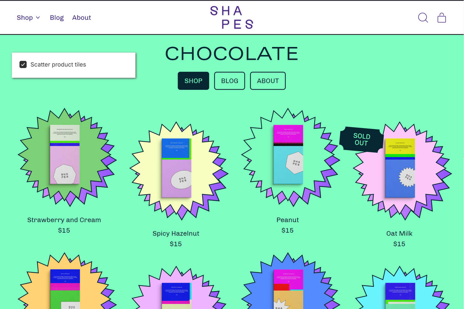
The previous image shows a store's "Chocolate" collection page, with product tiles. In the upper left, part of the Theme editor's Theme settings > Product tiles menu is displayed. The menu's Scatter product tiles option is set to on. With this option enabled, every alternate product tile displays at an offset height.
For general guidance with adjusting a theme setting, refer to Settings overview and Shopify help: Theme settings.
Configure Product tiles
To configure your Product tiles settings:
In the Theme editor, go to Theme settings > Product tiles.
Select a setting described in the following table.
| Setting name | Description |
|---|---|
| Content > Show vendor | Set the Show vendor option to on or off. Use this option to hide/show the names of product vendors inside the product tiles. |
| Content > Metafield namespace and key | In the Metafield namespace and key field, enter a metafield namespace and key to display content from a metafield below the product title and price inside the product tiles. Refer to Shopify help: Metafields. |
| Content > Show tags | Use the Show tags option to show or hide tags on product tiles. Tags style can be customized in Theme settings > Tags. Refer to Tags. |
| Content > Show "From" and "On sale" text next to product price | Use the Show "From" and "On sale" text next to product price option to show or hide a discount amount and on sale text next to product prices on product tiles. |
| Layout > Text align | Use the Text align options to align the section's text to the Left, Center, Right or Split. |
| Layout > Scatter product tiles | Set the Scatter product tiles option to on or off. Use this option to turn on or off displaying every second product tile at an offset height. |
| Layout > Image shape | Use the Image shape options to select a shape for images inside the product tiles. For example, select Default, Ellipse, Rounded nonagon, or Pixelated. Selecting some shapes will crop the image. Refer to Style images and videos with shapes. |
| Layout > Image aspect ratio | Use the Image aspect Ratio options to set the width-to-height ratio for images inside the product tiles. The options are Natural, Landscape, Square or Portrait. To use this option, set the Image shape option to one of the "Fit to image" shapes (Default, Ellipse, Pill, or Archway). |
| Hover effects > Image shown on hover | Use the Image shown on hover options to show the Second image or Last image on product tiles. The image is displayed then a cursor is placed over a product tile. To hide images, select None. Note that when you enable quick buy and variant images, this effect is disabled. |
| Hover effects > Preselect first swatch | Use the Preselect first swatch option to turn on or off preselecting the first swatch when the cursor is placed over a product tile. Note that this option only applies when color swatches are enabled in product tiles and the product has a color option. Disable this option to show the product’s featured image first. |
| Hover effects > Hover image when a variant image is selected | Use the Hover image when a variant image is selected options to show the Featured image, Second image or Last image on product tiles. The image is displayed then a cursor is placed over a product tile for a product with variants. To hide images, select None. Note that this option only applies when color swatches are enabled in product tiles and the product has a color option. To use this option, ensure the Image shown on hover setting is not None. |
| Hover effects > Zoom media | Use the Zoom media option to turn on or off the "Zoom media" effect. With this setting enabled, the product tile image is "zoomed in" when the cursor is placed over a product tile ("mouse over"). |
| Hover effects > Enlarge shape | Use the Enlarge shape option to turn on or off the "Enlarge shape" effect. With this setting enabled, the product tile image is enlarged when the cursor is placed over a product tile ("mouse over"). |
| Hover effects > Rotate shape | Use the Rotate shape option to turn on or off the "Rotate shape" effect. With this setting enabled, the product tile image rotates when the cursor is placed over a product tile ("mouse over"). |
| Hover effects > Rotate level | Adjust the Rotate level slider to specify the amount of rotation applied to the "Rotate shape" effect. The slider ranges from -90 to 90. To use this option, enable the Rotate shape option. |
| Hover effects > Lift shape | Use the Lift shape option to turn on or off the "Lift shape" effect. With this setting enabled, the product tile image raises when the cursor is placed over a product tile ("mouse over"). |
| Hover effects > Lift level | Adjust the Lift level slider to specify the amount of "lift" applied to the "Lift shape" effect. The slider ranges from 0.2 to 3.0. To use this option, enable the Lift shape option. |
| Badges > Theme settings (link) | Follow the Theme settings link to open the Theme settings > Badges menu in the Theme editor. Use the menu options to configure display settings for badges. Refer to Badges and Shopify help: Badges. |
| Badges > Show on sale or sold out badge | Use the Show on sale or sold out badge option to show or hide "on sale" and "sold out" badges. The badges are displayed on product tile images for store products listed as "on sale" or "sold out". Note that, if a product is both sold out and on sale, only the sold out badge will be displayed. |
| Badges > Metafield namespace and key | In the Metafield namespace and key field, enter a metafield namespace and key to display a metafield value inside a badge on product tiles. Metafields can hold additional product information that's not saved in Shopify admin, like product numbers and dimensions. Refer to Shopify help: Metafields and Show custom sticker badges on product tiles. |
| Mini product tiles > Image shape | Use the Image shape options to select a shape for images inside mini product tiles. For example, select Default, Ellipse, Rounded nonagon, or Pixelated. Selecting some shapes will crop the image. |
| Mini product tiles > Image aspect ratio | Use the Image aspect Ratio options to set the width-to-height ratio for images inside mini product tiles. The options are Natural, Landscape, Square, or Portrait. To use this option, set the Image shape option to one of the "Fit to image" shapes (Default, Ellipse, Pill, or Archway). |
| Quick buy > Enable variant buttons | Use the Enable variant buttons option to show or hide variant picker buttons in the quick buy area for product tiles. If a product has only two variants, or if swatches are enabled in product tiles and every product variant is a color option, enable adding variants to the cart directly from the tile. Refer to Show quick buy on product tiles. |
| Quick buy > Quick buy drawer (link) | Follow the Quick buy drawer link to open the Theme settings > Quick buy drawer menu in the Theme editor. Use the menu options to configure group picker options. To set up this feature, create a metaobject for the product group, then link it to each product with a metafield. Refer to Link related products with Product groups |
| Quick buy > Product group – group metafield key | In the Product group – group metafield key field, enter a namespace and key for a product group. The product group will be displayed in the quick buy area on product tiles. For example, enter custom.product_group. |
| Quick buy > Product group – product value metafield key | In the Product group – product value metafield key field, enter a namespace and key for a product group label. The label is displayed instead of product title alongside the picker in the quick buy area on product tiles. |
Note
To connect a metafield to a setting that supports metafields, select the Connect dynamic source icon displayed beside the setting in the Theme editor.
To learn how to connect a metafield to a supported setting, refer to Shopify help: Connecting metafields to your theme by using the Theme editor.