

Appearance
Sections overview
Shapes theme includes templates for common store pages such as the home page and product pages. Within each template, Shapes provides reusable sections and blocks for adding elements into your store's pages. Refer to Theme structure.
Instead of spending time recreating the same elements for every store page, use Shapes' templates, sections, and blocks as a convenient way to build pages quickly, and to maintain a consistent design across your store.
Theme structure
A typical store has different types of pages, such as product and blog post pages. Shapes provides a convenient template for each type of page.
For example:
The home page template defines what is displayed on your store's home page.
The default product page template defines what is displayed on a default product page.
Shapes' templates are composed of sections and blocks.
Section. Within a template, a container for an area of content, such as the sidebar, header, or footer, is called a section.
Block. A block is an element of content inside a section, like a product, a video, or an image with text.
Note
To learn how themes are structured, refer to Shopify help: Theme structure and Shopify developer help: Markup and features.
Page templates
Shapes contains default and additional page templates.
Default. All Shopify themes include a set of default page templates for creating common store pages. Shapes provides preconfigured pages created from its default page templates, including a home page and a Checkout page.
Additional. Additional page templates can be used to create store pages that are specific to Shapes. To use Shapes' additional page templates, you must assign the template to a page. Refer to Shopify help: Templates.
Shapes' page templates are listed below.
Note
* indicates an additional page template.
Home page
Products
- Default product
- Accessories
* - Bundle
* - Merch
* - Preorder
*
Collections
- Default collection
Collections list
Gift card
Cart
Checkout and new customer accounts
Classic customer accounts
- Customer account
- Customer activate account
- Customer addresses
- Customer login
- Customer order
- Customer register
- Customer reset password
Pages
- Default page
- About
* - Contact
* - Restaurant
*
Blogs
- Default blog
Blog posts
- Default blog post (article)
- Recipe
*
Search
Password
404 page
Static, content and template sections
By default, Shapes' templates are preconfigured with sections and blocks that are most relevant to a page's purpose. Templates can include the following types of sections.
Static sections are displayed in a fixed area on most pages.
Content sections can be added to almost every page.
Template sections are available only on specific pages.
Static sections
By default, all templates except the Checkout, Password, and Gift card templates include the static sections described in the following table.
| Section name | Description |
|---|---|
| Age check | Provide visitors with an age verification prompt for accessing your store. |
| Announcement bar | Provide messages for your store's visitors. For example, to announce sales or special discounts. |
| Call to action sticker | Overlay your home page with a sticker that links to a URL. For example, to link to another store page. |
| Footer | Provide visitors with a secondary menu, at the bottom of pages, for navigating your store. |
| Header | Provide visitors with a top menu for navigating pages in your store. |
| Popup | Display a popup over your store's pages. For example, to display promotional or advertising messages for your store's visitors. |
Typically, static sections cannot be fully removed or rearranged without altering Shapes' code. Altering the code is recommended only for expert users. However, you can hide some static sections by adjusting the section's settings. Refer to Shopify help: Hiding blocks and Shopify help: Edit a section.
Content sections
The content sections described in the following table can be added to or removed from any page, except the Checkout and Gift card pages.
| Section name | Description |
|---|---|
Blog posts * | Display a selection of blog posts on a store page. |
| Collage | Display a collage of media on a page, like images, products, stickers and shapes. |
Collection focus carousel * | Display products from a collection on a page using a carousel layout. |
| Collection list carousel | Display a selection of collections on a page, arranged in a carousel layout. |
| Collection list | Display a selection of collections on a store page. |
Comparison table * | Display a table on a page for comparing items, like product ingredients or features. |
| Curved text | Display text aligned to an arc or "curve" on a store page. |
| Custom liquid | Supports Liquid code for advanced customizations. |
| FAQ | Provide visitors with answers to common questions. |
Feature logo with image * | Overlay an image with a (feature) logo image on a store page. |
Feature testimonials * | Use a feature layout to display comments from customers, clients, and staff on a store page. |
| Feature text columns | Add text, arranged in columns, with headings, to a store page. |
| Feature text with image | Display an image overlaid with (feature) text on a store page. |
| Feature text with offset images | Display an offset arrangement of images, overlaid with (feature) text, on a store page. |
Feature text * | Display text on a store page, with or without links and heading effects. |
Featured collection * | Set a collection as a featured collection and display it on a page. |
| Featured collections | Display specific collections on a store page. |
| Featured product variants | Display variants of a product arranged in a Grid or Carousel layout. |
Featured product * | Display a specific product on a store page. |
| Features list | Display a table that describes product features on a store page. |
| Hero slideshow | Display a series of images, at the top of a store page (hero), overlaid with text. |
Icon list * | Display an arrangement of icons on a store page. |
| Image focus carousel | Display images (blocks) on a page using a carousel layout. |
Image with highlights * | Display an image surrounded by blocks of text on a store page. |
| Image with logo overlay | Overlay an image with a logo image on a store page. |
Image with text overlay * | Display an image, overlaid with text, on a page. |
| Image with text slideshow | Display a series of images with corresponding text on a page. |
Image with text * | Display an image and text, side-by-side, on a page. |
| Ingredients and nutrition | Display ingredients and a nutritional information table on a page. |
| Logo list | Display a list of logos associated with store items. |
| Menu | Display text items on a store page arranged in a menu layout. |
| Mixed shape product grid | Display product images (tiles), arranged in a grid layout, with a (different) shape applied to each tile. |
Newsletter * | Display a newsletter sign-up form on a page. |
| Offset collection gallery | Display an offset arrangement of items from a collection on a page. |
| Offset gallery | Display an offset arrangement of selected media on a page. |
| Recently viewed products | Display product tiles for recently viewed products on a page. |
| Rich text | Add formatted text with headings to a page. |
| Scrolling logos | Use a scrolling animation to display a list of logos on a page. |
| Scrolling pattern | Add an area with a moving or scrolling pattern to a page. |
Scrolling text with icons * | Display moving or scrolling icons with corresponding text on a store page. |
| Scrolling text | Add an area with moving or scrolling text to a page. |
| Shape carousel | Display a series of shapes on a store page, with embedded media. |
| Shapes with text overlay | Display shapes overlaid with text on a store page. |
| Testimonials | Display comments from customers, clients, and staff. |
Text columns with images * | Add areas of text with corresponding images, arranged in columns, to a store page. |
| Vertical video embeds | Display a series of (vertical) external videos on a store page, arranged in a slideshow layout. |
| Video carousel | Display videos arranged in a carousel layout on a page. |
| Video grid | Display videos arranged in a grid layout on a page. |
| Video with logo overlay | Display a video from your store's media library overlaid with a logo image, on a store page. |
Video with text overlay * | Display a video from your store's media library, overlaid with text, on a store page. |
| Video with text | Display a video from your store's media library, side-by-side with text, on a page. |
| Video | Display a video from your store's media library on a store page. |
Note
* denotes the content sections included in Shapes' home page template by default.
Template sections
A template section provides a dedicated content area for a particular template. Each template section is only available on specific pages. For example, only Shapes' 404 page template includes the 404 page template section.
The following table describes Shapes' template sections and the specific templates they belong to.
| Section name | Description | Corresponding template name |
|---|---|---|
| 404 page | Provide a message that's displayed whenever a visitor follows a link to a store page that cannot be found. | 404 page |
| Article featured image | Set how the featured image is displayed on a blog post (article) page. | Blog posts > Default blog post |
| Article page | Set how page content displays on a blog post (article) page. | Blog posts > Default blog post |
| Article recipe banner | Set how page content displays in the banner area of a recipe (blog post) page. | Blog posts > Recipe |
| Article recipe page | Set how page content displays on a recipe (blog post) page. | Blog posts > Recipe |
| Structured data | Generate a structured data schema for displaying recipes on a recipe (blog post) page. | Blog posts > Recipe |
| Blog posts | Use the section to set how the default Blog displays content. | Blogs > Default blog |
| Breadcrumbs | Display an indicator that shows the current page's position within your store's overall page structure. |
|
| Cart drawer | Set how your store's cart drawer is displayed. | Cart |
| Cart | Set how your store's cart is displayed. | Cart |
| Collection banner | Display a banner image above a collection on a collection page. | Collections > Default collection |
| Collection image | Display an image above a collection on a collection page. | Collections > Default collection |
| Collection list | Set how collections are displayed on the Collections list page. | Collections list |
| Free shipping bar | Display an indicator that tracks a customer's order amount against your store's free shipping threshold. | in the Theme editor, with the exception of Checkout, Password, and Gift card pages, you can add/remove the section to/from the Header area of any page. |
| Gift card | Set up a Gift card section on your store's gift card page to allow customers to purchase prepaid store credit. | Gift card |
| Hero logo | Display a custom logo on your store's pages using an image file from Shopify's free library or your store's media library. | in the Theme editor, with the exception of Checkout, Password, and Gift card pages, you can add/remove the section to/from the Header area of any page. |
| Pages - contact | Set how your store's contact form is displayed on the contact page. | Pages > Contact |
| Pages | Set how content is displayed on pages created from the Default, About, and Restaurant page templates. |
|
| Password | Provide "Opening Soon" information, on the password page, about store content that's pending release. | Password |
| Product grid - collection | Customize collection pages by adding features like a grid layout, or product filtering and sorting. | Default collection |
| Product | Set what's displayed on a Product page when a visitor selects a product from your store. |
|
| Related products | Display related products on a product page. |
|
| Search | Set how search results are displayed on the search page. | Search |
Note
To customize your store's pages, you can add, edit, remove, show, hide and rearrange sections and blocks. Refer to Configure blocks inside a section and Shopify help: Sections and blocks.
To use Shopify's Preview inspector tool to add, remove, show/hide, or move sections and blocks, refer to Shopify help: Preview inspector.
Configure blocks inside a section
Block names generally correspond to the name of the section that contains them. For example, a default FAQ section contains Question blocks, and a Testimonials section contains Testimonial blocks.
Some sections have more than one type of block. For example, by default, a Product section is pre-configured with blocks for a product's Title, Price, Variant picker, and Buy buttons. Optional blocks can also be added to some sections, where relevant.
Note
To learn about the available blocks in each section, refer to Static, content and template sections.
Configure, add, remove, hide, or move a block
To configure, add, remove, hide, show, or move a block inside a section:
Note
You can also apply most of the following block actions to sections. Refer to Shopify help: Customize your theme templates with sections and blocks.
In the Theme editor, select a page that contains the section with the block you want to configure.
From the side menu, select the required section.
From the section menu, choose one of the following tasks.
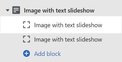
To configure a block, select the required block, and then adjust the corresponding block settings.
For example, the following image shows an Image with text slideshow block selected inside an Image with text slideshow section.
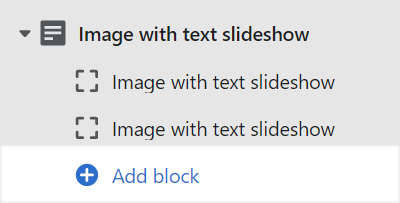
To add a block to a section, select Add
block(or "cross-hairs icon"), and then choose a block to add.For example, the following image shows the Add block option to add an Image with text slideshow block inside an Image with text slideshow section.
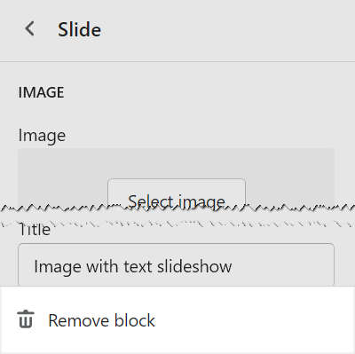
To remove a block from a section, select the Remove block ("trash") icon beside the block.
For example, the following image shows the option to remove an Image with text slideshow block from an Image with text slideshow section.
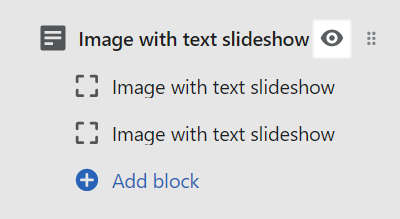
To hide or show a block inside a section, select the eye icon beside the block.
For example, in the following image, the option is enabled to show an Image with text slideshow block inside an Image with text slideshow section.
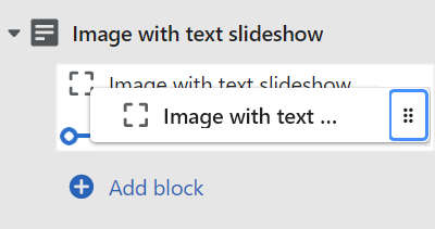
To move a block above or below another block in a section, select the drag icon beside the block. Then, drag the block to the required position.
For example, the following image shows moving one Image with text slideshow block above another inside an Image with text slideshow section.
Section Theme settings menu
In the Theme editor, the section settings menu for some sections includes an expandable Theme settings menu. Expand the menu to access applicable theme settings for the current section.
For example, in the following image, the expandable Theme settings menu is included inside a Product section. Refer to Shopify help: Theme editor.
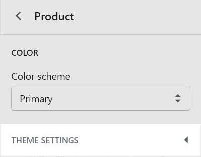
Each theme setting can apply to multiple sections and pages. Changing a theme setting from inside a section can affect other store sections and pages.
For example, by using the expandable Theme settings menu inside a Product section, you can adjust the Cart type. Any adjustments you make to the cart type theme settings inside the Product section are also applied to the other areas of your store that use the cart.
If you are unsure about an option when configuring a section in the expanded Theme settings menu, access the setting you require from the Theme editor's standard Theme settings panel instead. Refer to Settings overview.
Add, replace or remove an image or video inside a section or block
Some sections and blocks can contain images or videos (media). To upload media into a suitable section or block, use the media picker in the section or block settings menu. After you upload media, the media picker displays a thumbnail preview of the media item you uploaded. You can edit media to add, replace, or remove a media item inside a section or block.
To edit a media item inside a section or block:
Open your theme in the Theme editor.
At the top of the page, use the templates dropdown to select the page that contains the section or block with the media item you want to edit.
In the Theme editor, select the section or block you require.
In the media picker's thumbnail preview area, select the pencil icon to open the Media editor.
In the following image, the pencil icon is displayed in the media picker's thumbnail preview area.
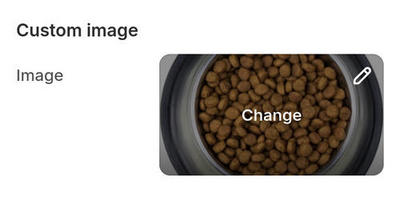
In the Media editor, apply the required changes.
Note
The changes you make are applied to the image file across your store. To learn about the Media editor, refer to Shopify help: Using the media editor.