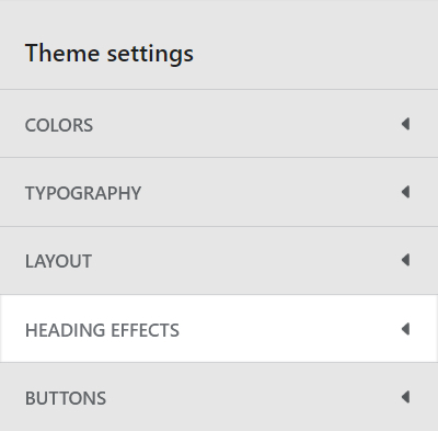
Appearance
Heading effects
This guide describes the Theme settings > Heading effects menu options.
Use the menu options to define the effects (text styles) applied to heading text throughout your store.
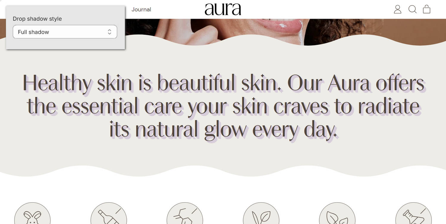
The previous image shows a Feature text section on a store's home page. In the upper left, part of Theme editor's Theme settings > Heading effects menu is displayed. The menu's Drop shadow style option is set to Full shadow. This option specifies the type of shadow effect to apply to heading text. The Full shadow effect is applied to the section's heading text.
For general guidance with adjusting a theme setting, refer to Settings overview and Shopify help: Theme settings.
Configure Heading effects
To configure your Heading effects settings:
In Theme editor, go to Theme settings > Heading effects.
Select a setting described in the following table.
| Setting name | Description |
|---|---|
| Apply style to standard headings | Select the checkbox Apply style to standard headings to turn on/off styling for standard headings. |
| Apply style to feature headings | Select the checkbox Apply style to feature headings to turn on/off styling for feature headings. |
| Style | Use the Style options to set the heading effects style to Text effects (style) or Italic styling. |
| Text effects > Text color | Use the Text color options to set the heading text to use the same color as the current color scheme's Text, Accent 1, Accent 2 or Background color. To use this option, set the Style option to Text effects. |
| Text effects > Stroke thickness | Adjust the Stroke thickness slider to set the width of the outline (stroke) around heading text characters. The slider ranges between 0 and 4 px (pixels). To use this option, set the Style option to Text effects. |
| Text effects > Stroke color | Use the Stroke color options to set a color for the outline (stroke) around heading text characters. Set the stroke to use the same color as the current color scheme's Text, Accent 1 or Accent 2 color. To use this option, set the Style option to Text effects. |
| Text effects > Drop shadow style | Use the Drop shadow style options to select a type of shadow effect for heading text. The options are None (off), Drop shadow or Full shadow. To use this option, set the Style option to Text effects. |
| Text effects > Drop shadow size | Adjust the Drop shadow size slider to set a size for the heading text shadow effect. The slider ranges between 0 and 20 em units. To use this option, set the Style option to Text effects. |
| Drop shadow size > Drop shadow color | Use the Drop shadow color options to set a color for the heading text shadow effect. Set the shadow effect to use the same color as the current color scheme's Text, Accent 1, Accent 2 or Card color. To use this option, set the Style option to Text effects. |
| Italic styling > Style | Use the Style options to select a style for the italic styling effect applied to heading text. The options are Italic or Normal. To use this option, set the Style option to Italic styling. |
| Italic styling > Color | Use the Color options to set a color for the italic styling effect applied to heading text. Set the color to use the same color as the current color scheme's Text, Accent 1 or Accent 2 color. To use this option, set the Style option to Italic styling. |
| Italic styling > Decoration | Use the Decoration options to select a decoration style for the italic styling effect. The options are Highlight or Color. To use this option, set the Style option to Italic styling. |
| Italic styling > Highlight top offset | Adjust the Highlight top offset slider between 10 and 50 % (percent) to set a top offset for the (highlight) italic styling effect. To use this option, set the Style option to Italic styling, and then set the Decoration option to Highlight. |
| Italic styling > Highlight bottom offset | Adjust the Highlight bottom offset slider between 50 and 100 % (percent) to set a bottom offset for the (highlight) italic styling effect. To use this option, set the Style option to Italic styling, and then set the Decoration option to Highlight. |
Note
Shapes provides typographical options for headings in Theme settings > Typography. Refer to Typography.