Appearance
Collection list - collage
This guide describes the Collection list - collage section.
Use the section to display collection images, arranged in a collage layout, on the Collections list page.

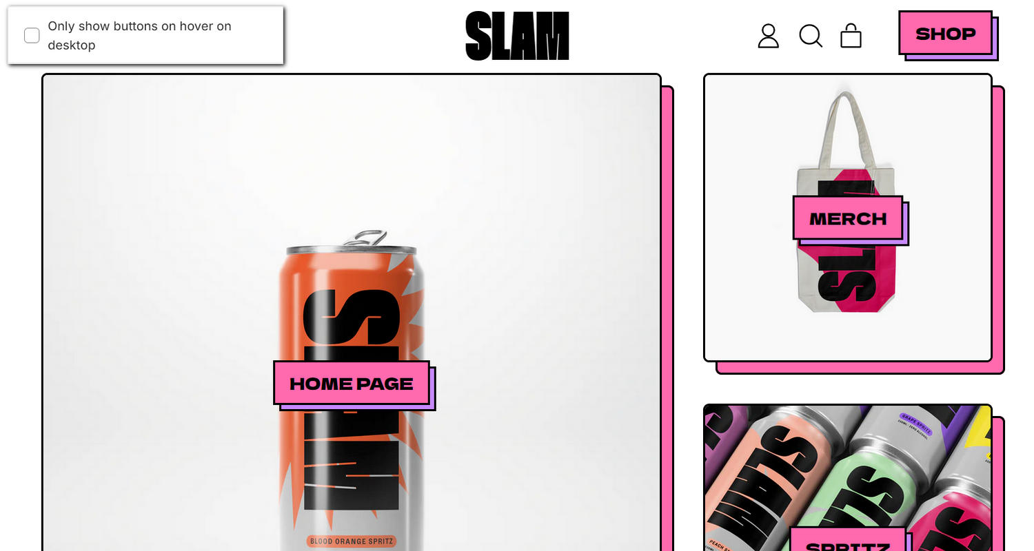
The previous image shows an example store's Collection list page. In the upper left, part of Theme editor's Collection list - collage section menu is displayed. The menu's Only show buttons on hover on desktop option is set to off. Turn on this option to only show the section's buttons when a visitor places their cursor over a collection tile (block) inside the section, on desktop display devices. With this option off, the tiles always display buttons. For example, in the previous image, buttons are always displayed over the store's Home page and Merch collection tiles inside the section.
For general guidance with modifying sections, refer to Sections overview, and Shopify help: Sections and blocks.
Configure the Collection list - collage section
To configure your Collection list - collage section:
Go to Customize theme.
In Theme editor, at the top of the page, use the dropdown to select Collections list.
Note
The section is available only on the Collections list page template.
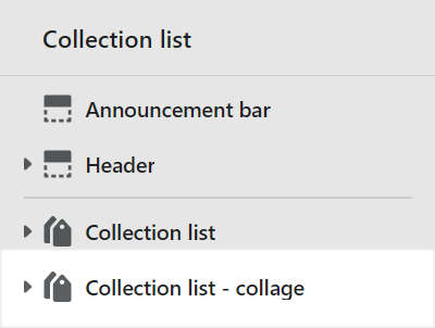
From the side menu, select Collection list - collage.

Select a setting described in the following table.
| Setting name | Description |
|---|---|
| Crop | Use the Crop options to select No crop, Landscape, Square or Portrait. Use this option to specify a cropping style for (collection tile) images inside the section. |
| Image shape | Use the Image shape options to select a shape. For example, select Default, Circle, Rounded nonagon, or Pixelated. Use this option to set a shape for (collection tile) images inside the section. Selecting some shapes will crop the image. Refer to Style images and videos with shapes. |
| Buttons > Button style | Use the Button style options to select Primary or Secondary. Use this option to specify a style for the section's buttons. Refer to Buttons. |
| Buttons > Show buttons on mobile | Set the Show buttons on mobile checkbox to on or off. Use this option to show/hide the section's buttons on mobile display devices. |
| Buttons > Only show buttons on hover on desktop | Set the Only show buttons on hover on desktop checkbox to on or off. Use this option to only show the section's buttons when a visitor places their cursor over a tile (block) inside the section. With this option off, the tiles always display the buttons. This setting applies to desktop display devices. |
| Color > Color scheme | Use the Color scheme picker to select a color scheme for the section. Refer to Colors. |
| Color > Theme settings (link) | Follow the Theme settings link to open Theme editor's Color theme settings. Use the settings to edit the theme colors for your entire store. |
| Color > Use gradient for background | Set the Use gradient for background checkbox to on or off. Use this option to turn on/off using a gradient as the section's background. |
| Theme settings | If available, select Theme settings to access additional settings for the section. Refer to Section theme settings menu. |
| Custom CSS | Select Custom CSS. In the box, enter custom CSS styles to apply only to the current section. Refer to Shopify help: Add custom CSS. To apply custom styles to your entire online store, refer to Theme settings > Custom CSS. |
Configure a block within a Collection list - collage section
To configure a block for your Collection list - collage section:
Go to Customize theme.
In Theme editor, at the top of the page, use the dropdown to select Collections list.
From the side menu, expand the Collection list - collage section menu.
To configure an existing block, select the block from the side menu.
To add a new block, select Add block, choose a block to add, and then select the block you added.

Note
Inside the section, you can add, remove, show, hide, and move blocks. Refer to Configure blocks inside a section, and Shopify help: Sections and blocks.
Apply a block setting described in the following table.
| Block name | Block description | Block setting(s) |
|---|---|---|
| Collection | Displays a store collection inside the section. |
|
| Background pattern | Displays a stylistic pattern as a background inside the section. | Refer to Background pattern. |
| Background shape | Displays a stylistic shape as a background inside the section. | Refer to Background shape. |
| Sticker | Overlays the section with a stylized sticker. | Refer to Stickers. |