

Appearance
Video with text
This guide describes how to set up the Video with text section.
Use the section to display a video from your store's media library, side-by-side with text, on a page.
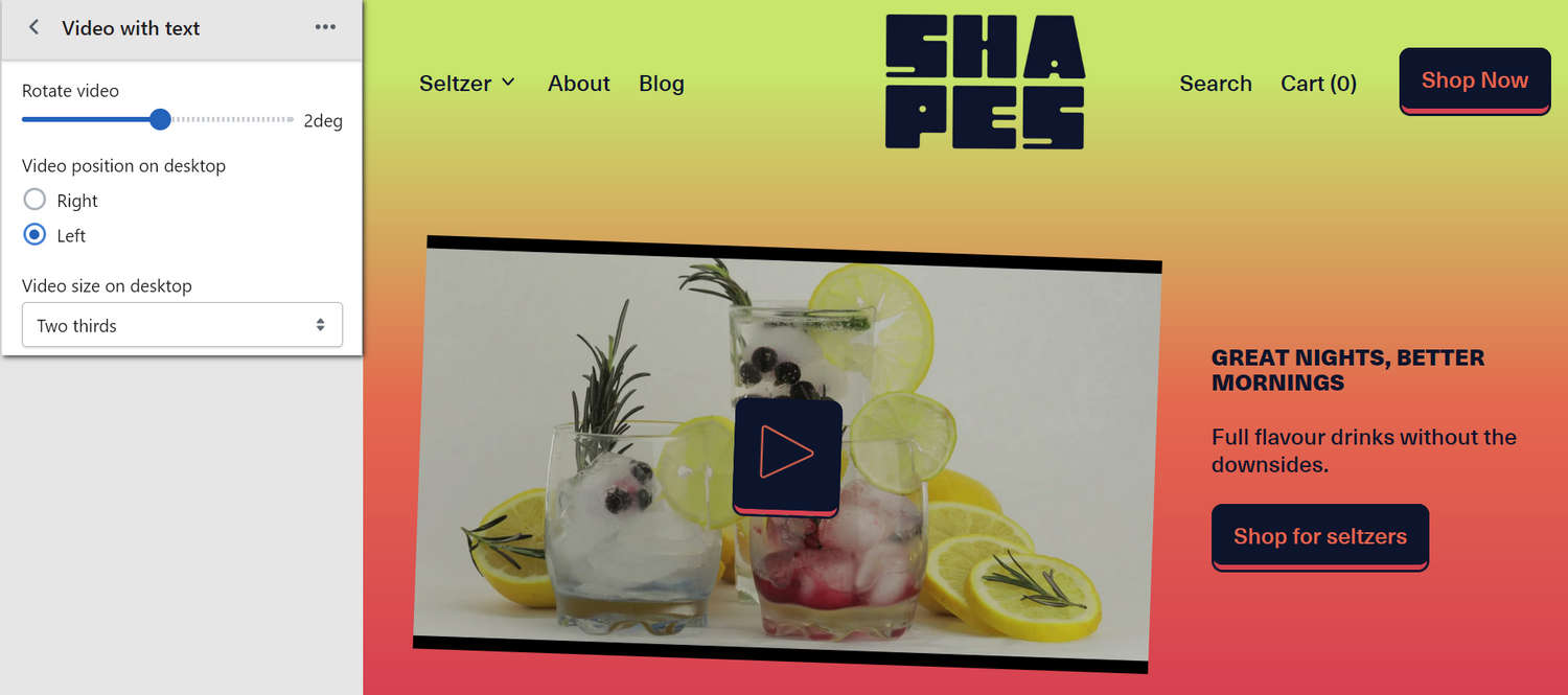
The previous image shows an example store's home page. In the upper left, part of the Theme editor's Video with text section menu is displayed. The menu's Video size on desktop option is set to 2/3. This option specifies a size for the video in the section on desktop display devices. For example, in the previous image, the section's video occupies 2/3 of the section's width.
For general guidance with modifying sections, refer to Sections overview and Shopify help: Sections and blocks.
Configure the Video with text section
To configure your Video with text section:
In the Theme editor, at the top of the page, use the dropdown to select a page that contains a Video with text section.
Note
The section can be added to any page, except Gift card and Customer pages. To add the section to the current page, select Add section > Video with text. Refer to Shopify help: Add a section.
From the side menu, select Video with text.
Select a setting described in the following table.
| Setting name | Description |
|---|---|
| Display on card | Use the Display on card option to show or hide a card behind the section. Refer to Shopify help: Cards. |
| Video > Video | Use the Video picker to select a video to display in the section. Refer to Add, replace or remove an image or video inside a section or block. |
| Video > Mode | Use the Mode option to select Preview or Autoplay to specify a play mode for the section's video. Autoplay plays the entire video automatically. Autoplay will not play sound or show controls. Preview plays a few seconds of the video. |
| Video > Playback | Use the Playback option to select Inline or Modal. Modal displays the video inside a modal overlay area during playback. Inline contains the video within the section during playback. To use this option, set the Mode option to Preview. |
| Video > Shape | Use the Shape option to select a shape for the section's video. For example, select Default, Ellipse, Rounded nonagon, or Pixelated. Shapes theme offers more than 70 shapes in categories such as Fit to image, Basic, Polygons, Stars, Scalloped circles, Square, Miscellaneous, and Variable. Refer to Style images and videos with shapes. Selecting some shapes will crop the video. Some shapes may crop out video controls, in this case we recommend Autoplay mode or Modal playback. |
| Video > Crop | Use the Crop options to select No crop, Landscape, Square, or Portrait. Use this option to set a cropping style for the section's video. This option is displayed when the Shape option is set to a "Fit to image" shape such as Default, Ellipse, Pill, or Archway. Refer to Style images and videos with shapes. |
| Video > Blob type | Adjust the Blob type slider to select the type of blob to apply to the section's video. This setting applies only when the Shape option is set to Blob. The slider ranges from 1 to 20. Refer to Style images and videos with shapes. |
| Video > Rotate | Adjust the Rotate slider between -90 and 90 degrees to rotate the video in the section. |
| Video > Disable media style | Use the Disable media style option to turn on or off applying the theme's media styles to the section's video. This option is recommended if using videos with a transparent background. |
| Video > Video position on desktop | Use the Video position on desktop options to position the section's video on the Right or Left on desktop display devices. |
| Video > Video size on desktop | Use the Video size on desktop options to select 1/3, 1/2, 3/5, or 2/3 to set a size for the section's video on desktop display devices. |
| Content > Title | In the Title field, enter text to display as the section's heading. Format the text and add links using the inline editor. |
| Content > Subheading | In the Subheading field, enter text to display as the section's subheading. Format the text and add links using the inline editor. To use this option, enter text in the Title field. |
| Content > Text | In the Text field, enter text to display as body text in the section. Format the text and add links using the inline editor. |
| Content > Text alignment | Use the Text alignment option to align the section's body text to the Left, Center, or Right. |
| Link > Button link | In the Button link field, enter a URL or select a store page to use as a link for the section's button. |
| Link > Label | In the Label field, enter text to display as a label for the section's button. |
| Color > Color scheme | Use the Color scheme picker to select a color scheme for the section. Refer to Colors. |
| Color > Use gradient for background | Use the Use gradient for background option to turn on or off using a gradient as the section's background. |
| Theme settings | If available, select Theme settings to access additional settings for the section. Refer to Section theme settings menu. |
| Custom CSS | Select Custom CSS. In the CSS field, enter custom CSS styles to apply only to the current section. Refer to Shopify help: Add custom CSS. To apply custom styles to your entire online store, refer to Theme settings > Custom CSS. |
| Remove section | Select Remove section to delete the section from the current page. |
Note
To connect a metafield to a setting that supports metafields, select the Connect dynamic source icon displayed beside the setting in the Theme editor.
To learn how to connect a metafield to a supported setting, refer to Shopify help: Connecting metafields to your theme by using the Theme editor.
Configure a block within a Video with text section
To configure a block within your Video with text section:
In the Theme editor, at the top of the page, use the dropdown to select a page that contains a Video with text section.
From the side menu, expand the Video with text section menu.
To configure an existing block, select the block from the side menu.
To add a new block, select Add block, choose a block to add, and then select the block you added.
Note
Inside the section, you can add, remove, show, hide, and move blocks. Refer to Configure blocks inside a section and Shopify help: Sections and blocks.
Apply a block setting described in the following table.
| Block name | Block description | Block setting(s) |
|---|---|---|
| Background pattern | Displays a stylistic pattern as a background inside the section. | Refer to Background pattern. |
| Background shape | Displays a stylistic shape as a background inside the section. | Refer to Background shape. |
| Sticker | Overlays the section with a stylized sticker. | Refer to Stickers. |
| Shape divider | Displays a stylized separator between the current section and the next/previous section. | Refer to Shape divider. |