

Skip to content

Product ​

This guide describes how to set up the Product section.

Use the section to set what's displayed on a product page created from the Default product, Accessories, Bundle, Merch, and Preorder page templates.
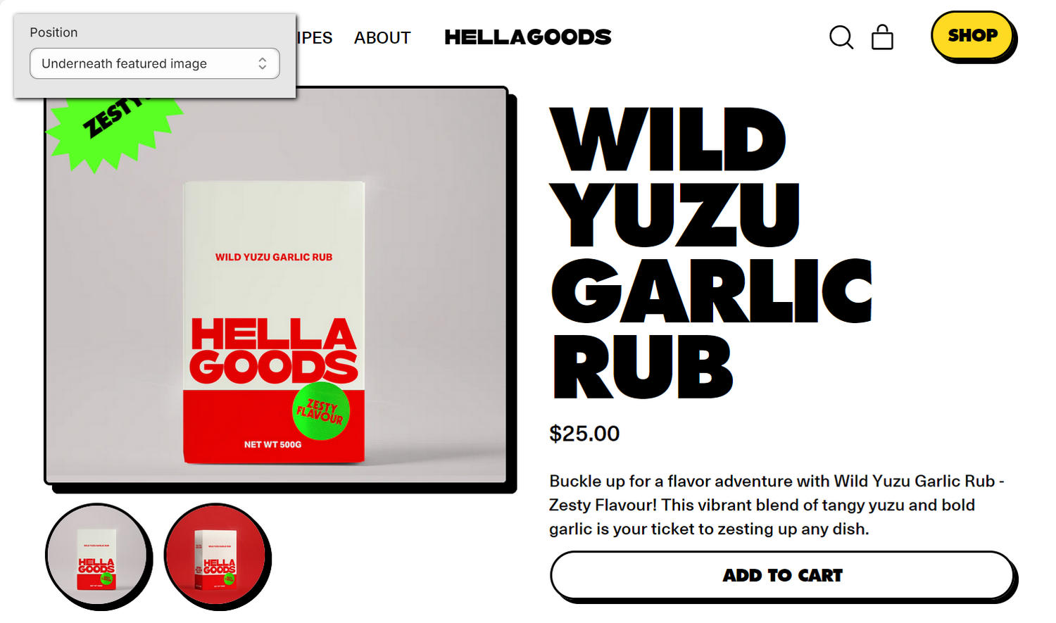
A Product section on a store's Product page in the Theme editor.

The previous image shows an example store's Default product page. In the upper left, part of the Theme editor's Product section menu is displayed. The menu's Thumbnails - Desktop > Position option is set to Under. This option specifies a position for thumbnail images relative to the featured image in the section on desktop display devices. For example, in the lower left area of the previous image, the section displays the thumbnail images below the product's featured image.

For general guidance with modifying sections, refer to Sections overview and Shopify help: Sections and blocks.

Configure the Product section ​

To configure your Product section:

  1. In the Theme editor, at the top of the page, use the dropdown to select Products > Default product, Products > Accessories, Products > Bundle, Products > Merch, or Products > Preorder.

    Note

    The section is available only on the Products > Default product, Products > Accessories, Products > Bundle, Products > Merch, or Products > Preorder pages.

  2. From the side menu, select Product.

  3. Select a setting described in the following table.

Setting nameDescription
Media > ShapeUse the Shape option to select a shape for the section's images. For example, select Default, Ellipse, Rounded nonagon, or Pixelated. Shapes theme offers more than 70 shapes in categories such as Fit to image, Basic, Polygons, Stars, Scalloped circles, Square, Miscellaneous, and Variable. Refer to Style images and videos with shapes. Selecting some shapes will crop the image. This option does not apply to videos or models.
Media > CropUse the Crop option to select No crop, Landscape, Square, or Portrait to specify a cropping style for images in the section. To use this option, select a Shape from the Fit to image category, such as Default or Ellipse.
Media > Enable image zoomUse the Enable image zoom option to show or hide a panel that contains images of a product. The panel opens when a product's image is selected in the section. The panel provides zoom in/out for images, arrow icons for navigating between images, and an X icon to close the panel.
Media > Enable video loopingUse the Enable video looping option to turn on or off continuous replay for videos in the section. If this setting is off, the video plays once. Using this setting requires uploading video media to the Products area of your Shopify admin. Refer to Shopify help: Product media.
Media > Autoplay videos on desktopUse the Autoplay videos on desktop option to turn on or off playing the section's videos automatically on desktop display devices. Note that video will be muted. The section does not support YouTube or Vimeo.
Media > Mobile widthUse the Mobile width option to select Full or 4/5 to set a width for the section's media on mobile display devices.
Media > Desktop widthUse the Desktop width option to select 1/2, 3/5, or 2/3 to set a width for the section's media on desktop display devices.
Media > Show slideshow arrows on desktopFor products with multiple images or videos, use the Show slideshow arrows on desktop option to show or hide arrow icons that move to the next and previous media item in the slideshow (media gallery). This setting applies to desktop display devices.
Thumbnails > ShapeUse the Shape option to select a shape for the section's thumbnail images. For example, select Default, Ellipse, Rounded nonagon, or Pixelated. Shapes theme offers more than 70 shapes in categories such as Fit to image, Basic, Polygons, Stars, Scalloped circles, Square, Miscellaneous, and Variable. Refer to Style images and videos with shapes. Selecting some shapes will crop the image.
Thumbnails > CropUse the Crop option to select No crop, Landscape, Square, or Portrait to specify a cropping style for thumbnail images in the section. To use this option, select a Shape from the Fit to image category, such as Default or Ellipse.
Thumbnails > SizeUse the Size option to select Standard or Large to set a size for thumbnail images in the section.
Thumbnails > Hide media shadowUse the Hide media shadow option to show or hide a shadow effect for thumbnail images in the section.
Thumbnails - Mobile > Show thumbnailsUse the Show thumbnails option to show or hide the section's thumbnail images on mobile display devices.
Thumbnails - Mobile > LayoutUse the Layout option to apply a Grid or Carousel layout to thumbnail images in the section on mobile display devices. Note that the options are available only when the Show thumbnails option is enabled.
Thumbnails - Desktop > PositionUse the Position option to select Under or Left to set a position for thumbnail images relative to the featured image in the section.
Thumbnails - Desktop > LayoutUse the Layout option to apply a Grid or Carousel layout to thumbnail images in the section on desktop display devices. Note that the options are available only when the Position option is set to Under.
Product form area > Display on cardUse the Display on card option to show or hide a card behind the section's product form area. Refer to Shopify help: Cards. Note that enabling this option will disable the "Display on card" setting on blocks.
Product form area > Max width of contentUse the Max width of content option to set the maximum width for content in the section's product form area to Max, Wide, or Narrow.
Variants > Select the first available variantUse the Select the first available variant option to turn on or off "First available variant" mode. When enabled, the first in-stock variant is automatically selected in the section. With this setting off, adding to the cart will not be possible until each product option has a selection.
Sticky add to cart > Enable sticky add to cartUse the Enable sticky add to cart option to turn on or off keeping the add to cart area displayed on the page when a visitor scrolls down past the buy buttons. The "sticky" add to cart hides when the visitor reaches the footer or scrolls back up the page. To use this option, add a Buy buttons block to the section.
Sticky add to cart > Display onUse the Display on option to specify which display devices display the "sticky" add to cart area. The options are Mobile and desktop, Mobile only, or Desktop only. To use this setting, turn on the Enable sticky add to cart option.
Sticky add to cart > Show product info on mobileUse the Show product info on mobile option to show or hide product info in the "sticky" add to cart area on mobile display devices. To use this setting, turn on the Enable sticky add to cart option and set Display on to a mobile option.
Sticky add to cart > CropUse the Crop option to select No crop, Landscape, Square, or Portrait to specify a cropping style for the section's "sticky" add to cart area. To use this setting, turn on the Enable sticky add to cart option.
Sticky add to cart > Color schemeUse the Color scheme picker to select a color scheme for the section's "sticky" add to cart area. To use this setting, turn on the Enable sticky add to cart option. Refer to Colors.
Sticky add to cart > Use card colorsSelect the Use card colors option to turn on or off applying the background color of the card from the next section to the section's "sticky" add to cart area. To use this setting, turn on the Enable sticky add to cart option.
Color > Color schemeUse the Color scheme picker to select a color scheme for the section. Refer to Colors.
Color > Use gradient for backgroundUse the Use gradient for background option to turn on or off using a gradient as the section's background.
Theme settingsIf available, select Theme settings to access additional settings for the section. Refer to Section theme settings menu.
Custom CSSSelect Custom CSS. In the CSS field, enter custom CSS styles to apply only to the current section. Refer to Shopify help: Add custom CSS. To apply custom styles to your entire online store, refer to Theme settings > Custom CSS.

Note

To connect a metafield to a setting that supports metafields, select the Connect dynamic source icon displayed beside the setting in the Theme editor.

To learn how to connect a metafield to a supported setting, refer to Shopify help: Connecting metafields to your theme by using the Theme editor.

Configure a block within a Product section ​

To configure a block within your Product section:

  1. In the Theme editor, at the top of the page, use the dropdown to select Products > Default product, Products > Accessories, Products > Bundle, Products > Merch, or Products > Preorder.

  2. From the side menu, expand the Product section menu.

  3. To configure an existing block, select the block from the side menu.

    To add a new block, select Add block, choose a block to add, and then select the block you added.

    Note

    Inside the section, you can add, remove, show, hide, and move blocks. Refer to Configure blocks inside a section and Shopify help: Sections and blocks.

  4. Apply a block setting described in the following table.

Block nameBlock descriptionBlock setting(s)
Title *Displays a product's title inside the section.
  • Use the Text align options to align text in the block to the Left or Center.
  • Use the Display on card option to show or hide a card behind the block. Adjacent blocks set to Display on card are merged into a single card. Refer to Shopify help: Cards.
  • Select Remove block to delete the block from the section.
Price *Displays a product's price inside the section.
  • Use the Show on sale badge option to hide or show the "on sale" badge in the block. Refer to Badges.
  • Use the Text align options to align text in the block to the Left or Center.
  • Use the Display on card option to show or hide a card behind the block. Adjacent blocks set to Display on card are merged into a single card. Refer to Shopify help: Cards.
  • Select Remove block to delete the block from the section.
Quantity selector *Displays a quantity selector, inside the section, for choosing the number of products to purchase.
  • Use the Show label option to show or hide the "Quantity" label prefix in the block.
  • Use the Label position on desktop options to specify a position for label text in the block on desktop display devices. The options are Left or Above. To use this option, enable the Show label setting.
  • Use the Display on card option to show or hide a card behind the block. Adjacent blocks set to Display on card are merged into a single card. Refer to Shopify help: Cards.
  • Select Remove block to delete the block from the section.
Variant picker *Displays a variant picker for choosing variations of a product, inside the section.
  • Use the Hide sold out or unavailable variants options to show or hide variant options in the block, for variants that are currently out of stock or not available for purchase.
  • Use the Display on card option to show or hide a card behind the block. Adjacent blocks set to Display on card are merged into a single card. Refer to Shopify help: Cards.
  • Use the Options style options to set a style for the variant picker to Dropdown or Button.
  • Use the Full width buttons option to turn on or off displaying the blocks buttons at full width. To use this option, set the Options style option to Button.
  • Use the Show option labels option to show or hide the product option names (labels) in the block.
  • Use the Label position on desktop options to specify a position for label text in the block on desktop display devices. The options are Left or Above. To use this option, enable the Show option labels setting.
  • Select Remove block to delete the block from the section.
Buy buttons *Displays the Add to cart and Buy it now buttons inside the section.
  • Use the Show dynamic checkout button options to show or hide a button with the customer's preferred payment method, beside the Add to cart button, in the block. Refer to Shopify help: Dynamic checkout buttons. Note the button is hidden for preorder products.
  • Use the Display on card option to show or hide a card behind the block. Adjacent blocks set to Display on card are merged into a single card. Refer to Shopify help: Cards.
  • Use the Show total price option to show or hide the total product price inside the Add to cart button.
  • Use the Show total compare-at price option to show or hide the compare-at product price inside the Add to cart button. Refer to Shopify help: Setting a compare-at price. To use this option, enable the Show total price option.
  • Use the Show installments option to show or hide Shop Pay Installments in the block. Refer to Shopify help: Shop Pay Installments.
  • Use the Show pickup availability option to show or hide indicators, in the block, for products that can be collected from designated customer "pick up" locations. Refer to Shopify help: Show pickup availability to your customers.
  • Use the Show recipient information form for gift card products option to show or hide the recipient information form. With this option enabled, visitors who purchase a gift card from your store can use the form to enter a personal message, and send the message to the gift card's recipient. Refer to Shopify help: Add recipient fields to your gift card product.
  • Select Remove block to delete the block from the section.
Description *Displays a text area to contain additional product information, inside the section.
  • Use the Truncate description option to show or hide a Read more button in the block. Selecting the button opens an expanded text area that contains additional product information. Enable this setting for products with variant images and longer descriptions. To use this setting, turn off collapsible tabs.
  • Use the Text align options to align text in the block to the Left or Center.
  • Use the Display on card option to show or hide a card behind the block. Adjacent blocks set to Display on card are merged into a single card. Refer to Shopify help: Cards.
  • Select Remove block to delete the block from the section.
Product groupDisplays a customizable product picker inside the section for selecting sibling products from within a product group.
  • In the Product group metafield key field, enter a namespace and key for a product group. The product group is displayed in the block as product tiles. For example, enter custom.product_group.
  • In the Product display title metafield key field, enter a namespace and key for a product display title. When available, this title is displayed instead of the product's title on the block's product tiles.
  • Use the Display on card option to show or hide a card behind the block. Note that adjacent product blocks set to display on card will merge into a single card. Refer to Shopify help: Cards.
  • Use the Options style options to select Button, Swatches, Thumbnails, or Dropdown. This setting defines the visual layout for product group pickers in the block. To use these options, create a metaobject for a product group, then link it to each product with a metafield.
  • Use the Full width buttons options to turn on or off "Full width buttons mode". With this setting enabled, product group buttons span the full width. To use this option, set Options style to Button.
  • Use the Show value option to show or hide the value text on the block's product tiles. To use this option, set Options style to Swatches or Thumbnails.
  • Use the Show option labels option to show or hide the text label associated with the variant picker in the block.
  • Use the Label position on desktop options to specify a position for the label associated with the variant picker in the block on desktop display devices. The options are Left or Above. To use this option, enable the Show option labels option.
  • Select Remove block to delete the block from the section.
VendorDisplays the name of a product's vendor inside the section.
  • Use the Text align options to align text in the block to the Left or Center.
  • Use the Display on card option to show or hide a card behind the block. Adjacent blocks set to Display on card are merged into a single card. Refer to Shopify help: Cards.
  • Select Remove block to delete the block from the section.
Star ratingDisplays customer submitted product ratings, represented as star icons, inside the section.
  • Use the Display on card option to show or hide a card behind the block. Adjacent blocks set to Display on card are merged into a single card. Refer to Shopify help: Cards.
  • Select Remove block to delete the block from the section.
Rich textDisplays an area of formatted text inside the section.
  • In the Text field, enter text to display in the block. Format the text and add links using the inline editor.
  • Use the Text align options to align text in the block to the Left or Center.
  • Use the Display on card option to show or hide a card behind the block. Adjacent blocks set to Display on card are merged into a single card. Refer to Shopify help: Cards.
  • Select Remove block to delete the block from the section.
TextDisplays a text area to contain additional product information, inside the section.
  • In the Text field, enter text to display in the block.
  • Use the Text size options to set the size of the block's text to Small or Regular.
  • Use the Icon options to choose a graphical icon to display beside the text in the block. There are more than 50 icons, including: Box, Check mark, Map pin, Price tag, and Star, as well as icons related to food and health. For no icon, select None (default).
  • Use the Display on card option to show or hide a card behind the block. Adjacent blocks set to Display on card are merged into a single card. Refer to Shopify help: Cards.
  • Select Remove block to delete the block from the section.
Icon rowDisplays a list of items with icons, inside the section, arranged in a horizontal row.
  • Use the Uppercase option to turn on or off uppercase for text in the block.
  • Use the Alignment options to select Start, Center, or Spread. Use this option to control the alignment of the block's icons. The Start option aligns icons to the start of the block (typically, the left side). The Center option center-aligns the block's icons. The Spread option distributes the icons evenly throughout the block.
  • Adjust the Thickness slider between 1 and 2. Use this option to specify a line thickness for the block's icons.
  • Use the Background color options to select Transparent, Accent 1, Accent 2, Card, or Text. Use this option to specify a background color for the block's icons. The color you select is applied from the containing section's current color scheme. Alternatively, to apply a transparent background to the icons, select Transparent.
  • Use the Show border option to show or hide border lines around the block's icons.
  • Use the Width options to select Small, Medium, Large, or XL (extra large). Use this option to specify a width for the block's icons.
  • For items 1 to 5, select the Item # > Icon options to choose a graphical icon to display beside the item's text in the block. There are more than 50 icons, including: Box, Check mark, Map pin, Price tag, and Star, as well as icons related to food and health. For no icon, select None (default).
  • For items 1 to 5, use the Item # > Text field to enter text to display beside the item in the block.
  • Use the Display on card option to show or hide a card behind the block. Adjacent blocks set to Display on card are merged into a single card. Refer to Shopify help: Cards.
  • Select Remove block to delete the block from the section.
Image rowDisplays a list of items with images, inside the section, arranged in a horizontal row.
  • Adjust the Images max width slider between 20 and 200 pixels. Use this option to specify a maximum width for the block's images.
  • Use the Alignment options to select Start, Center, or Spread. Use this option to control the alignment of the block's images. The Start option aligns images to the start of the block (typically, the left side). The Center option center-aligns the block's images. The Spread option distributes the images evenly throughout the block.
  • For items 1 to 5, use the Item # > Image # picker to select an image to display in the block. Refer to Add, replace or remove an image or video inside a section or block.
  • For items 1 to 5, use the Item # > Text # field to enter text to display beside the item in the block.
  • Use the Display on card option to show or hide a card behind the block. Adjacent blocks set to Display on card are merged into a single card. Refer to Shopify help: Cards.
  • Select Remove block to delete the block from the section.
Inventory statusDisplays a text indicator of a product's availability, inside the section. Note that inventory status is only shown for variants whose inventory is tracked in your Shopify admin.
  • Adjust the Low inventory threshold slider to set a value between 0 and 100. When the in-stock quantity of a product is greater than the slider value, the text Ready to ship is displayed in the block. Otherwise, the text Low stock is displayed in the block.
  • Use the Show inventory count option to show or hide a count of remaining stock in the block after the Low inventory threshold is exceeded. With this option enabled, the block displays the text "Only n in stock". n is the in-stock quantity of the product.
  • Use the Display on card option to show or hide a card behind the block. Adjacent blocks set to Display on card are merged into a single card. Refer to Shopify help: Cards.
  • Select Remove block to delete the block from the section.
Pop-upDisplays a pop-up overlay to contain additional product information, inside the section.
  • Use the Icon options to choose a graphical icon to display beside the text in the block. There are more than 50 icons, including: Box, Check mark, Map pin, Price tag, and Star, as well as icons related to food and health. For no icon, select None (default).
  • In the Link label field, enter text for the link to use as a label in the block. When the link is selected, a pop-up overlay is displayed.
  • Use the Page > Select page picker to select a store page. The page you select is used as a source of content that's added into the block. Contact form fields will not be displayed in the pop up.
  • Use the Display on card option to show or hide a card behind the block. Adjacent blocks set to Display on card are merged into a single card. Refer to Shopify help: Cards.
  • Select Remove block to delete the block from the section.
LiquidDisplays advanced customizations from Liquid code, like app snippets, inside the section.
  • In the Liquid field, enter Liquid template language code. Add app snippets or other Liquid code to create advanced customizations to add into the block.
  • Use the Display on card option to show or hide a card behind the block. Adjacent blocks set to Display on card are merged into a single card. Refer to Shopify help: Cards.
  • Select Remove block to delete the block from the section.
Collapsible tabDisplays a text area with expandable tabs, to contain additional product information, inside the section.
  • Use the Show bottom border option to show or hide a border at the bottom of the block. This option is displayed when the block or the section's product form area is displayed on a card.
  • Use the Icon options to choose a graphical icon to display beside the block's title text. There are more than 50 icons, including: Box, Check mark, Map pin, Price tag, and Star, as well as icons related to food and health. For no icon, select None (default).
  • In the Heading field, enter text to display as the block's title text.
  • Use the Uppercase option to turn on or off uppercase for text in the block.
  • In the Tab content field, enter text to display as tab content in the block. Format the text and add links using the inline editor.
  • Use the Tab content from page > Select page picker to choose content from another store page to add into the block.
  • Use the Display on card option to show or hide a card behind the block. Adjacent blocks set to Display on card are merged into a single card. Refer to Shopify help: Cards.
  • Select Remove block to delete the block from the section.
Share buttonsDisplays an area, inside the section, with buttons for sharing links to your store's products via social media. Refer to Social media.
  • Use the Display on card option to show or hide a card behind the block. Adjacent blocks set to Display on card are merged into a single card. Refer to Shopify help: Cards.
  • Select Remove block to delete the block from the section.
Nutritional informationDisplays formatted nutritional information inside the section.Refer to Show nutritional information on product pages.
Horizontal bar chartDisplays a bar chart inside the section to illustrate a product feature.Refer to Add bar charts to product pages.
Comparative scaleDisplays a scale inside the section to illustrate relationships between product features.Refer to Add comparative scales to product pages.
Complementary productsWhen a customer selects a product from your store, related products are displayed inside the section.

To set up complementary products, install the Shopify search & discovery app, and refer to Shopify developer help: Product recommendations.

  • In the Heading field, enter text to display as title text in the block.
  • Adjust the slider Maximum products to show to set the total number of products to display in the block. The minimum number is 1, and the maximum is 10.
  • Use the Product tile style options to select Mini or Standard. Use this option to specify a style for the block's product tiles.
  • Use the Enable quick buy option to show or hide the quick buy options in the block. Refer to Shopify help: Dynamic checkout buttons. This option applies only if the Product tile style option is set to Mini.
  • Use the Display on card option to show or hide a card behind the block. Adjacent blocks set to Display on card are merged into a single card. Refer to Shopify help: Cards.
  • Select Remove block to delete the block from the section.
TagsDisplays product tags associated with the section's featured product.
  • Use the Title size options to select Small or Base. Use this option to set the block's title text to use a small text size or to the same text size as the base font.
  • Use the Alignment options to align tags to the Left, Center, or Right.
  • Use the Link tags to tagged collection option to turn on or off linking the block's tags to the tag you defined for the block's custom collection. These tags are used when the Filter tags from option is set to Custom.
  • Use the Filter tags from option to display All or Custom tags in the block that are associated with the section's featured product. The All option displays all tags associated with the section's featured product. The Custom option displays the tags associated with the collection you choose using the block's Custom collection picker.
  • Use the Custom collection picker to select a tagged collection to use as a source of tags displayed in the block.
  • Use the Display on card option to show or hide a card behind the block. Adjacent blocks set to Display on card are merged into a single card. Refer to Shopify help: Cards.
  • Select Remove block to delete the block from the section.
Features listDisplays details about a product's features inside the section, using a table layout.
  • Use the Uppercase option to turn on or off uppercase for text in the block.
  • For items 1 to 6, in the Item # > Text field, enter text to display in a table row in the block. For example, enter text that describes a product feature.
  • Use the Show border between rows option to show or hide a border between the block's rows.
  • Use the Show top and bottom border option to show or hide a top and bottom border for list items in the block.
  • Use the Display on card option to show or hide a card behind the block. Adjacent blocks set to Display on card are merged into a single card. Refer to Shopify help: Cards.
  • Select Remove block to delete the block from the section.
Dot ratingDisplays a product rating scale graphic, with "dots" as rating markers.
  • Use the Uppercase option to turn on or off uppercase for text in the block.
  • Use the Dot color options to select Text, Accent 1, or Accent 2. Use this option to specify a color for the block's dots. The color you select is applied from the section's current color scheme.
  • For items 1 to 6, in the Item # > Text field, enter text to display as label text for the rating item.
  • For items 1 to 6, adjust the Item # > Rating slider between 0 and 5 dots. Use this option to specify the number of dots to display as a rating for the item.
  • For items 1 to 6, in the Item # > Dynamic rating field, enter a source for displaying ratings dynamically. This option overrides the other block setting.
  • Use the Display on card option to show or hide a card behind the block. Adjacent blocks set to Display on card are merged into a single card. Refer to Shopify help: Cards.
  • Select Remove block to delete the block from the section.
TabsDisplays a row of body text below a selectable heading inside the section.
  • Use the Uppercase heading option to turn on or off uppercase for headings in the block.
  • For items 1 to 3, in the Item # > Heading field, enter text to display as the tab item's title.
  • For items 1 to 3, in the Item # > Content field, enter text to display as the tab item's body text in the block. Format the text and add links using the inline editor.
  • For items 1 to 3, use the Item # > Content from page > Select page picker to choose a store page as a source for the tab item's content displayed in the block.
  • Use the Style options to select Underline or Border. Use this option to specify a style for the block's active tab.
  • Use the Color options to select Text, Accent 1, Accent 2, or Card. Use this option to specify a color for the block's active tab. The color you select is applied from the section's current color scheme.
  • Use the Display on card option to show or hide a card behind the block. Adjacent blocks set to Display on card are merged into a single card. Refer to Shopify help: Cards.
  • Select Remove block to delete the block from the section.
Information listDisplays additional product information inside the section, using a list layout.
  • For items 1 to 5, in the Item # > Heading field, enter text to display as the item's title text.
  • For items 1 to 5, in the Item # > Content field, enter text to display as the item's body text. Format the text or add a link using the inline editor. For a multi-line list layout, add each list item on a new line.
  • Adjust the Heading column width on desktop slider between 5 and 25 ch. Use this option to specify a width for the block's heading column on desktop display devices.
  • Use the Bold heading option to turn on or off bold text for the block's heading.
  • Use the Append colon to heading option to show or hide a colon character appended to the block's heading.
  • Use the Display on card option to show or hide a card behind the block. Adjacent blocks set to Display on card are merged into a single card. Refer to Shopify help: Cards.
  • Select Remove block to delete the block from the section.
SpacerDisplays an area of empty (white) space inside the section.Adjust the Height slider between 0.5 and 10 times (x). Use this option to display more or less empty (white) space in the block.
Background patternDisplays a stylistic pattern as a background inside the section.Refer to Background pattern.
Background shapeDisplays a stylistic shape as a background inside the section.Refer to Background shape.
StickerOverlays the section with a stylized sticker.Refer to Stickers.
Shape dividerDisplays a stylized separator between the current section and the next/previous section.Refer to Shape divider.