Appearance
Colors
This guide describes the Theme settings > Colors menu options.
Use the menu options to set how colors are displayed throughout your store. Refer to Shopify help: Colors.
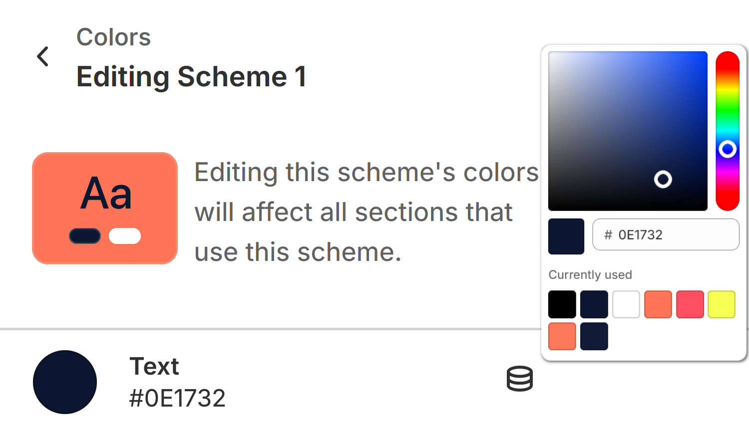
The previous image shows part of Theme editor's Theme settings > Colors menu. The settings adjust the color that's applied to the Scheme 1 color scheme's text.
For general guidance with adjusting a theme setting, refer to Settings overview and Shopify help: Theme settings.
Color schemes
With Shapes, you can create different sets of colors called Color schemes. Shapes provides 6 default color schemes, and supports up to 21 color schemes for your store. Refer to Shopify help: Color schemes.
Color schemes provide a quick and easy way to use colors consistently across your store. Instead of colorizing store elements individually, to apply colors to blocks, sections and page templates, simply reuse the colors from your color schemes.
The following table describes Shapes' default color schemes.
| Color scheme name | Description |
|---|---|
| Scheme 1 | This is your store's default color scheme. |
| Scheme 2 to 6 | Additional default color schemes for your store. |
Configure colors
To configure your Colors settings:
In Theme editor, go to Theme settings > Colors.
Select a setting described in the following table.
| Setting name | Description |
|---|---|
| Schemes > Scheme 1 > Text | To set the Scheme 1 color scheme's default color for text, select Text, and then use the color picker, enter a hex color value, or choose a Currently used color. |
| Schemes > Scheme 1 > Text > Connect dynamic source | To display a text color from a dynamic source, if available, select the Connect dynamic source icon, beside the Text color selector, and then choose a dynamic source to add. You must define sources of dynamic content. Refer to Shopify help: Metafields. |
| Schemes > Scheme 1 > Text contrast | To set the Scheme 1 color scheme's default color for contrasting with the scheme's text color, select Text contrast, and then use the color picker, enter a hex color value, or choose a Currently used color. |
| Schemes > Scheme 1 > Text contrast > Connect dynamic source | To display a contrasting text color from a dynamic source, if available, select the Connect dynamic source icon, beside the Text contrast color selector, and then choose a dynamic source to add. You must define sources of dynamic content. Refer to Shopify help: Metafields. |
| Schemes > Scheme 1 > Background | To set the Scheme 1 color scheme's background color, select Background, and then use color picker, enter a hex color value, or choose a Currently used color. |
| Schemes > Scheme 1 > Background > Connect dynamic source | To display a background color from a dynamic source, if available, select the Connect dynamic source icon, beside the Background color selector, and then choose a dynamic source to add. Refer to Shopify help: Metafields. |
| Schemes > Scheme 1 > Gradient | To set the Scheme 1 color scheme's default gradient colors, select Gradient, and then use the gradient picker options. Refer to Set up a color scheme gradient. |
| Schemes > Scheme 1 > Accent 1 > Accent | To set the Scheme 1 color scheme's primary color for accented elements, like hover over text and hyperlinks, select Accent, and then use the color picker, enter a hex color value, or choose a Currently used color. |
| Schemes > Scheme 1 > Accent 1 > Accent > Connect dynamic source | To display a primary accent color from a dynamic source, if available, select the Connect dynamic source icon, beside the Accent color selector, and then choose a dynamic source to add. Refer to Shopify help: Metafields. |
| Schemes > Scheme 1 > Accent 1 > Contrast | To set the Scheme 1 color scheme's color for contrasting with the scheme's primary accent color, select Contrast, and then use the color picker, enter a hex color value, or choose a Currently used color. |
| Schemes > Scheme 1 > Accent 1 > Contrast > Connect dynamic source | To display a primary accent contrast color from a dynamic source, if available, select the Connect dynamic source icon, beside the Contrast color selector, and then choose a dynamic source to add. Refer to Shopify help: Metafields. |
| Schemes > Scheme 1 > Accent 2 > Accent | To set the Scheme 1 color scheme's secondary color for accented elements, like hover over text and hyperlinks, select Accent, and then use the color picker, enter a hex color value, or choose a Currently used color. |
| Schemes > Scheme 1 > Accent 2 > Accent > Connect dynamic source | To display a secondary accent color from a dynamic source, if available, select the Connect dynamic source icon, beside the Accent color selector, and then choose a dynamic source to add. Refer to Shopify help: Metafields. |
| Schemes > Scheme 1 > Accent 2 > Contrast | To set the Scheme 1 color scheme's color for contrasting with the scheme's secondary accent color, select Contrast, and then use the color picker, enter a hex color value, or choose a Currently used color. |
| Schemes > Scheme 1 > Accent 2 > Contrast > Connect dynamic source | To display a secondary accent contrast color from a dynamic source, if available, select the Connect dynamic source icon, beside the Contrast color selector, and then choose a dynamic source to add. Refer to Shopify help: Metafields. |
| Schemes > Scheme 1 > Cards > Text | To set the Scheme 1 color scheme's color for card text, select Text, and then use the color picker, enter a hex color value, or choose a Currently used color. |
| Schemes > Scheme 1 > Cards > Text > Connect dynamic source | To display a card text color from a dynamic source, if available, select the Connect dynamic source icon, beside the Text color selector, and then choose a dynamic source to add. Refer to Shopify help: Metafields. |
| Schemes > Scheme 1 > Cards > Background | To set the Scheme 1 color scheme's color for card backgrounds, select Background, and then use the color picker, enter a hex color value, or choose a Currently used color. |
| Schemes > Scheme 1 > Cards > Background > Connect dynamic source | To display a card background color from a dynamic source, if available, select the Connect dynamic source icon, beside the Background color selector, and then choose a dynamic source to add. Refer to Shopify help: Metafields. |
| Scheme 2 to 6 | Provides the Scheme 2 to Scheme 7 color schemes with the same color options as the Scheme 1 color scheme. |
| Add Scheme | To add a new color scheme select Add scheme, and then choose colors for your new color scheme. To save your changes, select Save. |
| Layout > Drawer color scheme > Edit (link) | Follow the Edit link to open the color theme settings menu for the color scheme that's applied to your store's drawers (modals). Use the menu to set up colors for the drawer's color scheme. |
| Layout > Drawer color scheme > Change | Use the Change options to select a color scheme for your store's drawers (modals). The scheme you select applies to your store's cart drawer, popups, and other modals. |
| Selected text > Background color | Use the Background color options to specify a background color for areas of selected text. When a store visitor selects text on a store page, the background color you choose displays behind the selected text. Set the text background color to use the Text, Accent 1 or Accent 2 color, from color scheme applied to the section that contains the selected text. |
Set up a color scheme gradient
Shapes' color schemes can use gradients to blend two or more colors together, like red and yellow. In Shapes, color stops set the amount of each color for the gradient to blend; like 20% red and 80% yellow. Refer to Shopify help: Gradients.
To set up a color scheme gradient:
In Theme settings > Colors, locate the color scheme you want to colorize, and then select Gradient.
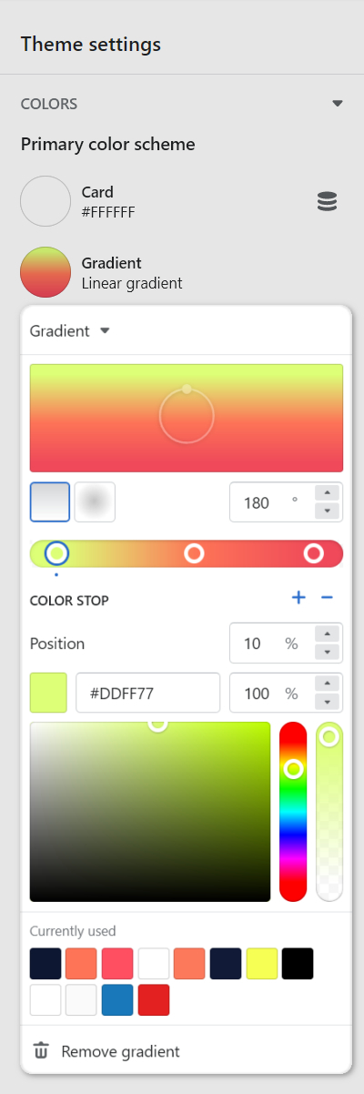
For example, in the following image, Gradient is selected for the Scheme 1 color scheme.
Select a setting described in the following table.
| Setting name | Description |
|---|---|
| Gradient/CSS | Use Gradient/CSS dropdown to select the type of gradient to configure. To use CSS code to specify a gradient, choose CSS, and then add CSS code into the CSS code box. To use the gradient selector options, select Gradient, choose a gradient, and then apply a setting described in this table. |
| Gradient > Direction (wheel) | Rotate the gradient Direction wheel to adjust the angle of the gradient between 0 and 360 degrees. This setting applies only to linear style gradients. |
| Gradient > Linear style (icon) | Select the Linear style icon to set the gradient style to Linear. |
| Gradient > Radial style (icon) | Select the Radial style icon to set the gradient style to Radial. |
| Gradient > Direction (textbox) | In the Direction textbox, enter a value or use the Up/ Down arrows to adjust the angle of the gradient between 0 and 360 degrees. |
| Gradient > Position (slider) | Adjust the Position slider to specify how much of the currently selected color stop is used by the gradient. |
| Gradient > Color stop | Select the + and - icons to add or remove gradient color stops. The minimum number of color stops is 2 and the maximum is 10. |
| Gradient > Position (textbox) | In the Position textbox, enter a value between 0 and 100 percent to specify how much of the currently selected color stop is used by the gradient. |
| Gradient > Color (textbox) | In the Color textbox, enter a hex color value to set a color for the currently selected color stop. |
| Gradient > Opacity | In the Opacity textbox, enter a value between 0 (transparent) and 100 percent to adjust the visibility of the currently selected color stop. |
| Gradient > Color (picker) | Use the Color picker to set a color for the currently selected color stop. Alternatively, if available, select a Recently selected color or a Currently used color. |
| Remove gradient | Select Remove gradient to delete the gradient from the current color scheme. |