Appearance
Comparison table
This guide describes the Comparison table section.
Use the section to display a table on a store page for comparing items, like product ingredients or features.
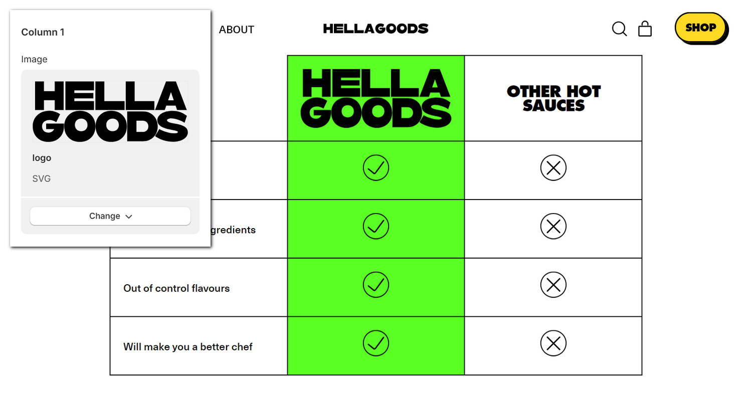
The previous image shows an example store's home page. In the upper left, part of Theme editor's Comparison table section menu is displayed. The menu's Column 1 > Image picker contains the "Hella Goods" image. This option specifies the image to use as a heading for the table's first column inside the section. In the center of the previous image, the section displays the Hella Goods image inside the table.
For general guidance with modifying sections, refer to Sections overview, and Shopify help: Sections and blocks.
Configure the Comparison table section
To configure your Comparison table section:
Go to Customize theme.
In Theme editor, at the top of the page, use the dropdown to select a page that contains a Comparison table section.
Note
The section can be added into any page, except Giftcard and Customer pages. To add the section into the current page, select Add section > Comparison table. Refer to Shopify help: Add a section.
From the side menu, select Comparison table.
Select a setting described in the following table.
| Setting name | Description |
|---|---|
| Title | In the Title box, enter text to display as a heading inside the section. Format the text and add links using the Text editor pane. |
| Title > Connect dynamic source | To display (Title) text from a dynamic source, select the Connect dynamic source icon beside the Title* box, and then choose a metafield to add. Refer to Shopify help: Metafields. |
| Layout > Display on card | Set the Display on card checkbox to on or off. Use this option to show/hide a card behind the section. Refer to Shopify help: Cards. |
| Layout > Max width | Use the Max width options to select None, Small, Medium or Large. Use this option to specify a maximum width for content inside the section. |
| Layout > Highlighted column | Use the Highlighted column options to select None, 1, 2, 3 or 4. Use this option to choose a table column to highlight inside the section. |
| Layout > Highlighted column color | Use the Highlighted column color options to specify a color for the highlighted column inside the section's table. Set the table's highlighted column to use the section color scheme's Accent 1 or Accent 2 color. |
| Layout > Show 'scroll left to right' label on mobile | Set the Show 'scroll left to right' label on mobile checkbox to on or off. Use this option to show/hide a text label inside the table's first row and first column position (table cell A1). The label contains left and right arrow icons with the text "Scroll left to right". The label is displayed on mobile devices. |
| Column 1 > Heading | In the Heading box, enter text to display as a heading for the first table column. |
| Column 1 > Heading > Connect dynamic source | To display (heading) text from a dynamic source, select the Connect dynamic source icon beside the Heading box, and then choose a metafield to add. Refer to Shopify help: Metafields. |
| Column 1 > Image | Use the Image picker options to set an image as the heading for the first table column. Refer to Add, replace or remove an image or video inside a section or block. |
| Column 1 > Image > Connect dynamic source | To display an image from a dynamic source, select the Connect dynamic source icon beside the Image selector, and then choose a metafield to add. Refer to Shopify help: Metafields. |
| Column 2 > [Options] | Provides the second table column with the same options as the first column. |
| Column 3 > Enable column | Set the Enable column 3 checkbox to on or off. Use this option to show/hide the third table column inside the section. |
| Column 3 > Heading | In the Heading box, enter text to display as a heading for the third table column. |
| Column 3 > Heading > Connect dynamic source | To display (heading) text from a dynamic source, select the Connect dynamic source icon beside the Heading box, and then choose a metafield to add. Refer to Shopify help: Metafields. |
| Column 3 > Image | Use the Image picker options to set an image as the heading for the third table column. Refer to Add, replace or remove an image or video inside a section or block. |
| Column 3 > Image > Connect dynamic source | To display an image from a dynamic source, select the Connect dynamic source icon beside the Image selector, and then choose a metafield to add. Refer to Shopify help: Metafields. |
| Column 4 > [Options] | Provides the forth table column with the same options as the third column. |
| Icon style > Thickness | Adjust the Thickness slider between 1 and 2. Use this option to specify a line thickness for the section's icons. |
| Icon style > Background color | Use the Background color options to select Transparent, Accent 1, Accent 2, Card or Text. Use this option to specify a background color for the section's icons. The color you select is applied from the section's current color scheme. Alternatively, to apply a transparent background to the section's icons, select Transparent. |
| Icon style > Show border | Set the Show border checkbox to on or off. Use this option to show/hide border lines around the section's icons. |
| Color > Color scheme | Use the Color scheme picker to select a color scheme for the section. Refer to Colors. |
| Color > Theme settings (link) | Follow the Theme settings link to open Theme editor's Color theme settings. Use the settings to edit the theme colors for your entire store. |
| Color > Use gradient for background | Set the Use gradient for background checkbox to on or off. Use this option to turn on/off using a gradient as the section's background. |
| Theme settings | If available, select Theme settings to access additional settings for the section. Refer to Section theme settings menu. |
| Custom CSS | Select Custom CSS. In the box, enter custom CSS styles to apply only to the current section. Refer to Shopify help: Add custom CSS. To apply custom styles to your entire online store, refer to Theme settings > Custom CSS. |
| Remove section | Select Remove section to delete the section from the current page. |
Configure a block within a Comparison table section
To configure a block for your Comparison table section:
Go to Customize theme.
In Theme editor, at the top of the page, use the dropdown to select a page that contains a Comparison table section.
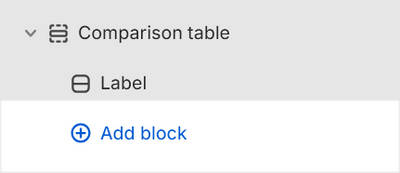
From the side menu, expand the Comparison table section menu.
To configure an existing block, select the block from the side menu.
To add a new block, select Add block, choose a block to add, and then select the block you added.
Note
Inside the section, you can add, remove, show, hide, and move blocks. Refer to Configure blocks inside a section, and Shopify help: Sections and blocks.
Apply a block setting described in the following table.
| Block name | Block description | Block setting(s) |
|---|---|---|
| Row | Displays a table row inside the section. |
|
| Background pattern | Displays a stylistic pattern as a background inside the section. | Refer to Background pattern. |
| Background shape | Displays a stylistic shape as a background inside the section. | Refer to Background shape. |
| Sticker | Overlays the section with a stylized sticker. | Refer to Stickers. |
| Shape divider | Displays a stylized separator between the current section and the next/previous section. | Refer to Shape divider. |