Appearance
Popup
This guide describes the Popup section.
Use this section to display a popup over your store's pages. This section is typically used to display promotional and advertising messages to your store's visitors.
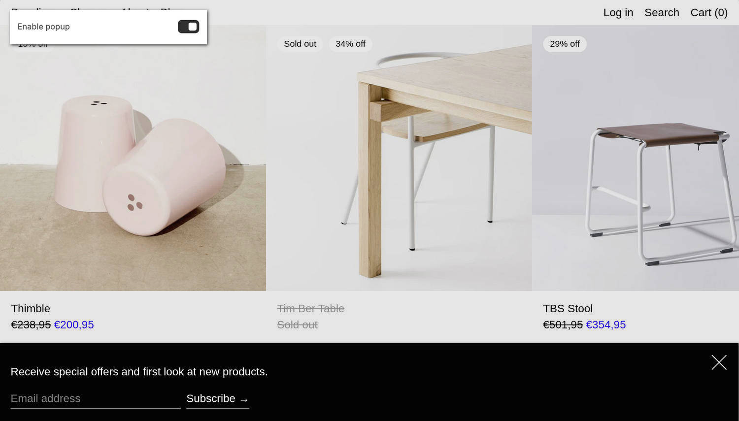
The previous image shows a Popup section at the bottom of a store's home page. The section contains the text "Receive special offers..." and a form that allows visitors to subscribe to the store's newsletter. In the upper left, part of the Theme editor's section menu is displayed. The menu's Enable popup option is enabled. With this setting enabled, the section displays on the store's home page.
For general guidance with modifying sections, refer to Sections overview and Shopify help: Sections and blocks.
Configure the Popup section
To configure your Popup section:
In the Theme editor, at the top of the page, use the theme templates dropdown to select the home page.
Note
The section is accessible from all pages, excluding Checkout, Password, and Gift card pages.
From the side menu, select Popup.
Select a setting described in the following table.
| Setting name | Description |
|---|---|
| Enable popup | Set the Enable popup option to on or off. With this option enabled, the popup is displayed to your store's visitors. |
| Delay | Adjust the Delay slider to set a delay between 2 sec and 30 sec (seconds) before the section appears on a page. Changes to the delay time cannot be previewed from inside the Theme editor. Visit your store's home page in a web browser to preview your adjustments. To use this option, turn on the Enable popup option. |
| Frequency | Adjust the Frequency slider to set the number of days before a closed popup reappears to a store visitor. The slider ranges from 2 to 30 days. To use this option, turn on the Enable popup option. |
| Content > Heading | In the Heading field, enter text to display as the section's heading. To use this option, turn on the Enable popup option. |
| Content > Text | In the Text field, enter text to display as body text in the section. Format the text and add links using the inline editor. To use this option, turn on the Enable popup option. |
| Content > Text size | Use the Text size setting to specify a size for the section's text. The options are S = small, M = medium, L = large, and XL = extra large. To use this option, turn on the Enable popup option. |
| Content > Call to action | Use the Call to action option to choose the type of prompt displayed in the section. The options are Newsletter signup and Button. The Newsletter signup option displays a form that visitors can use to subscribe to your store's newsletter. Subscribers' email addresses are added to your store's "accepts marketing" list. The Button option adds a button to the section. To use this option, turn on the Enable popup option. To learn how to manage customer details, refer to Shopify help: Managing customers. |
| Content > Button link | In the Button link field, enter a URL or select a link to a store page. The link is applied to the section's button. To use this option, turn on the Enable popup option and set Call to action to Button. |
| Content > Button text | In the Button text field, enter the label for the section's button. To use this option, turn on the Enable popup option and set Call to action to Button. |
| Color > Color scheme | Use the Color scheme picker to select a color scheme for the section. Refer to Colors. |
| Theme settings | If available, select Theme settings to access additional settings for the section. Refer to Section theme settings menu. |
| Custom CSS | Select Custom CSS. In the CSS field, enter custom CSS styles to apply only to the current section. Refer to Shopify help: Add custom CSS. To apply custom styles to your entire online store, refer to Theme settings > Custom CSS. |
| Remove section | Select Remove section to delete the section from the current page. |
Note
To connect a metafield to a setting that supports metafields, select the Connect dynamic source icon displayed beside the setting in the Theme editor.
To learn how to connect a metafield to a supported setting, refer to Shopify help: Connecting metafields to your theme by using the Theme editor.