Appearance
Logo list
This guide describes the Logo list section.
Use the section to display a list of logos associated with store items.
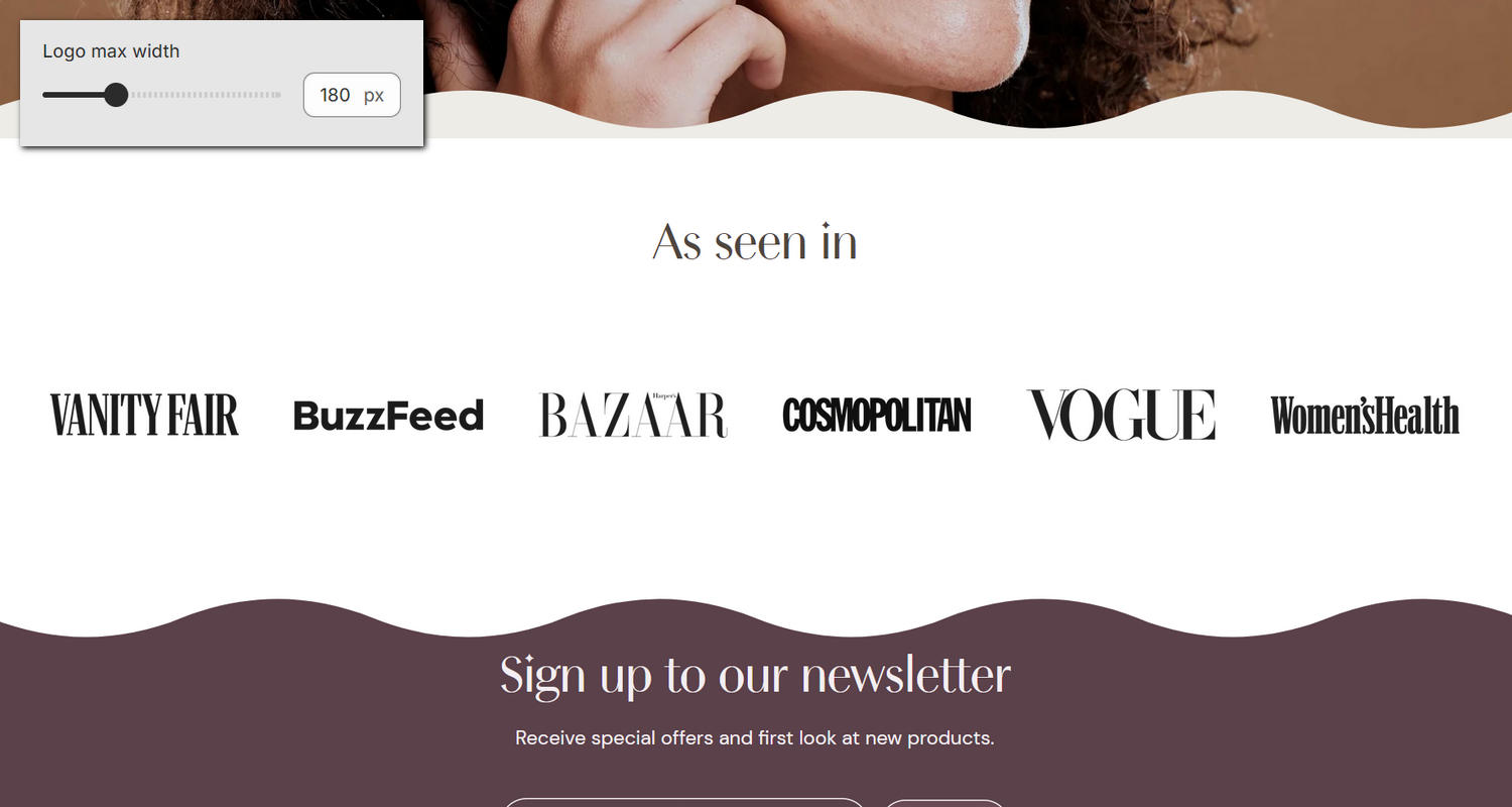
The previous image shows an example store's home page. In the upper left, part of Theme editor's Logo list section menu is displayed. The menu's Logo max width option is set to 180 px (pixels). This option specifies a maximum width for logo images (blocks) inside the section. For example, in the previous image, the specified width is applied to the section's logo images.
For general guidance with modifying sections, refer to Sections overview, and Shopify help: Sections and blocks.
Configure the Logo list section
To configure your Logo list section:
Go to Customize theme.
In Theme editor, at the top of the page, use the dropdown to select a page that contains a Logo list section.
Note
The section can be added into any page, except Giftcard and Customer pages. To add the section into the current page, select Add section > Logo list. Refer to Shopify help: Add a section.
From the side menu, select Logo list.
Select a setting described in the following table.
| Setting name | Description |
|---|---|
| Title | In the Title text box, enter (heading) text to display inside the section. Format the text and add links, using the Text editor pane. |
| Title > Connect dynamic source | To display (title) text from a dynamic source, select the Connect dynamic source icon beside the Title box, and then choose a metafield to add. Refer to Shopify help: Metafields. |
| Logo max width | Adjust the Logo max width slider between 50 and 500 pixels. Use this option to specify a maximum width for the section's logo images (blocks). |
| Color > Color scheme | Use the Color scheme picker to select a color scheme for the section. Refer to Colors. |
| Color > Theme settings (link) | Follow the Theme settings link to open Theme editor's Color theme settings. Use the settings to edit the theme colors for your entire store. |
| Color > Use gradient for background | Set the Use gradient for background checkbox to on or off. Use this option to turn on/off using a gradient as the section's background. |
| Theme settings | If available, select Theme settings to access additional settings for the section. Refer to Section theme settings menu. |
| Custom CSS | Select Custom CSS. In the box, enter custom CSS styles to apply only to the current section. Refer to Shopify help: Add custom CSS. To apply custom styles to your entire online store, refer to Theme settings > Custom CSS. |
| Remove section | Select Remove section to delete the section from the current page. |
Configure a block within a Logo list section
To configure a block for your Logo list section:
Go to Customize theme.
In Theme editor, at the top of the page, use the dropdown to select a page that contains a Logo list section.
From the side menu, expand the Logo list section menu.
To configure an existing block, select the block from the side menu.
To add a new block, select Add block, choose a block to add, and then select the block you added.
Note
Inside the section, you can add, remove, show, hide, and move blocks. Refer to Configure blocks inside a section, and Shopify help: Sections and blocks.
Apply a block setting described in the following table.
| Block name | Block description | Block setting(s) |
|---|---|---|
Logo * | Displays a logo image inside the section |
|
| Background pattern | Displays a stylistic pattern as a background inside the section. | Refer to Background pattern. |
| Background shape | Displays a stylistic shape as a background inside the section. | Refer to Background shape. |
| Sticker | Overlays the section with a stylized sticker. | Refer to Stickers. |
| Shape divider | Displays a stylized separator between the current section and the next/previous section. | Refer to Shape divider. |