

Appearance
Quick buy drawer
This guide describes the Theme editor's Theme settings > Quick buy drawer menu options.
Use the menu options to configure your store's Quick buy drawer for supported product pages. When a store visitor selects a product, the Quick buy drawer opens as an overlay with product variants and purchase options.
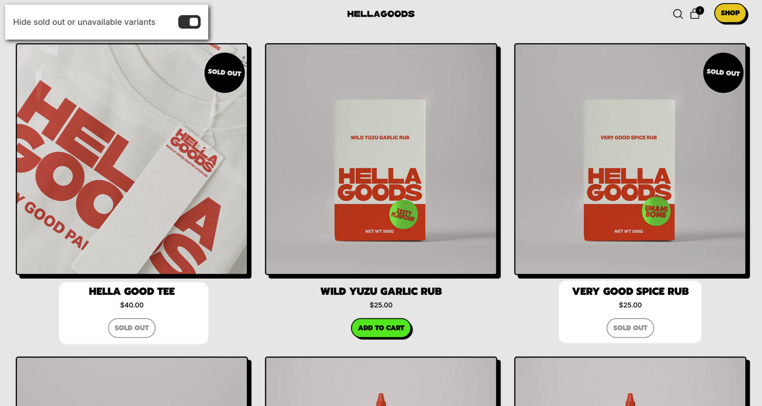
The previous image shows a Product grid section on a store's Default collection page. The section is configured to show the quick buy options. In the upper left, part of the Theme editor's Theme settings > Quick buy drawer is displayed. The menu's Hide sold out or unavailable variants option is enabled. When this option is enabled, sold-out and unavailable variants are shown with grayed-out text. For example, the image shows the Hella good tee and Very good spice rub products listed as Sold out and both products are displayed with grayed-out text applied.
For general guidance with adjusting a theme setting, refer to Settings overview and Shopify help: Theme settings.
Set up the quick buy drawer
To set up the quick buy drawer:
In the Theme editor, go to Theme settings > Quick buy drawer.
Select a setting described in the following table.
| Setting name | Description |
|---|---|
| Product media crop | Use the Product media crop option to select No crop, Landscape, Square, or Portrait. This setting controls the aspect ratio of the product media displayed in the quick buy drawer. |
| Variants > Select the first available variant | Use the Select the first available variant option to turn on or off "First available variant" mode. When enabled, the first in-stock variant is automatically selected in the quick buy drawer. With this setting off, adding to the cart will not be possible until each product option has a selection. |
| Quantity selector > Show quantity selector | Use the Show quantity selector option to show or hide a quantity input field in the quick buy drawer. |
| Quantity selector > Show label | Use the Show label option to show or hide the text label associated with the quantity selector in the quick buy drawer. To use this option, enable the Show quantity selector option. |
| Quantity selector > Label position on desktop | Use the Label position on desktop option to specify a position for the label associated with the quantity selector in the quick buy drawer on desktop display devices. The options are Left or Above. |
| Variant picker > Options style | Use the Options style option to select Dropdown or Button. This setting specifies the visual style for product variant pickers in the quick buy drawer. |
| Variant picker > Full width buttons | Use the Full width buttons option to turn on or off "Full width buttons mode". With this setting enabled, variant picker buttons fill the available width of the drawer container. To use this option, set Options style to Button. |
| Variant picker > Show option labels | Use the Show option labels option to show or hide the text label associated with the variant picker in the quick buy drawer. |
| Variant picker > Label position on desktop | Use the Label position on desktop option to specify a position for the label associated with the variant picker in the quick buy drawer on desktop display devices. The options are Left or Above. |
| Variant picker > Hide sold out or unavailable variants | Use the Hide sold out or unavailable variants option to show or hide variant options in the quick buy drawer, for variants that are currently out of stock or not available for purchase. |
| Product group > Options style | Use the Options style option to select Button, Swatches, Thumbnails, or Dropdown. This setting defines the visual layout for product group pickers in the quick buy drawer. To use these options, create a metaobject for a product group, and then link it to each product with a metafield. Then, enable product groups in Theme settings > Product grid tiles > Quick buy. |
| Product group > Full width buttons | Use the Full width buttons option to turn on or off "Full width buttons mode". With this setting enabled, product group buttons span the full width. To use this option, set Options style to Button. |
| Product group > Show value | Use the Show value option to show or hide a value overlay on products from a product group with a value label in the quick buy drawer. To use this option, set Options style to Swatches or Thumbnails. |
| Product group > Show option labels | Use the Show option labels option to show or hide the text labels associated with product groups in the quick buy drawer. |
| Product group > Label position on desktop | Use the Label position on desktop option to specify a position for the text labels associated with product groups in the quick buy drawer. The options are Left or Above. |
| Buy buttons > Show dynamic checkout button | Use the Show dynamic checkout button option to show or hide a dynamic checkout button for accelerated checkout in the quick buy drawer. With this option enabled, each customer will see their preferred payment method from those available on your store, such as PayPal or Apple Pay. Note that the button is hidden for pre-order products. Refer to Shopify help: Accelerated checkout buttons. |
| Buy buttons > Show installments | Use the Show installments option to show or hide Shop Pay Installments in the quick buy drawer. Refer to Shopify help: Shop Pay Installments. |
| Buy buttons > Show total price | Use the Show total price option to show or hide the calculated total price in the quick buy drawer. |
| Buy buttons > Show total compare-at price | Use the Show total compare-at price option to show or hide the total compare-at product price in the quick buy drawer. Refer to Shopify help: Setting sale prices for products. To use this option, enable Show total price. |
| Description > Show description | Use the Show description option to show or hide product descriptions in the quick buy drawer. |
| Description > Truncate description | Use the Truncate description option to show or hide truncated (shortened) product descriptions in the quick buy drawer. |
Note
To connect a metafield to a setting that supports metafields, select the Connect dynamic source icon displayed beside the setting in the Theme editor.
To learn how to connect a metafield to a supported setting, refer to Shopify help: Connecting metafields to your theme by using the Theme editor.