

Appearance
Video grid
This guide describes how to set up the Video grid section.
Use the section to display videos arranged in a grid layout on a page.
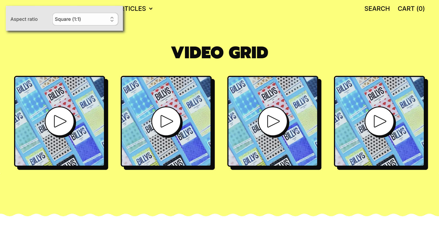
The previous image shows the home page of an example store. In the upper left, part of the Theme editor's Video grid section menu is displayed. The menu's Aspect ratio option is set to Square (1:1). This option sets a width-to-height ratio for videos in the section. For example, in the previous image, a square width-to-height ratio is applied to the section's videos.
For general guidance with modifying sections, refer to Sections overview and Shopify help: Sections and blocks.
Configure the Video grid section
To configure your Video grid section:
In the Theme editor, use the theme templates dropdown at the top of the page to select a page that contains a Video grid section.
Note
The section can be added to any page except Gift card and Checkout & customer accounts pages. To add the section to the current page, select Add section > Video grid. Refer to Shopify help: Add a section.
From the side menu, select Video grid.
Select a setting described in the following table.
| Setting name | Description |
|---|---|
| Heading | In the Heading field, enter text to display as the section's heading. Format the text and add links using the inline editor. |
| Subheading | In the Subheading field, enter text to display as the section's subheading. Format the text and add links using the inline editor. |
| Video > Aspect ratio | Use the Aspect ratio option to select Full portrait (9:16), Portrait (4:5), Square (1:1), Standard (4:3), Widescreen (16:9), or Extra-wide (2.35:1). Use this option to set a width-to-height ratio for videos in the section. |
| Video > Mode | Use the Mode options to select Preview or Autoplay. Use this option to specify a play mode for the section's videos. In Autoplay mode, the video plays without sound or controls. Preview mode plays a few seconds of the video. |
| Video > Playback | Use the Playback option to select Inline or Modal. Modal displays the video inside a modal overlay area during playback. Inline contains the video within the section during playback. This option is only available when Mode is set to Preview. |
| Video > Disable media style | Use the Disable media style option to show or hide styles applied to the section's videos. Enable this setting if you use a video with a transparent background. |
| Layout > Style | Use the Style option to select Grid or Carousel to specify a layout style for the section. The Grid layout displays the section's content arranged in a grid. The Carousel layout displays the section's content arranged in a carousel (slideshow). When using carousel layout, we recommend using at least four video blocks. |
| Layout > Videos per row on mobile | Use the Videos per row on mobile option to set the section to display 1 or 2 videos in each grid row on mobile display devices. To use this option, set the Style option to Grid. |
| Layout > Videos per row on desktop | Adjust the Videos per row on desktop slider between 2 and 5. This setting specifies the number of videos to display on each grid row in the section on desktop display devices. To use this option, set the Style option to Grid. |
| Layout > Slideshow focus | Use the Slideshow focus option to select Center or Left to specify an area of focus for the section's carousel. To use this option, set the Style option to Carousel. |
| Layout > Mobile slide width | Use the Mobile slide width option to select 3/5 or Full to specify a width for the section's carousel slides on mobile display devices. To use this option, set the Style option to Carousel. |
| Layout > Desktop slide width | Adjust the Desktop slide width slider between 20 and 60 percent to specify a width for the section's carousel slides on desktop display devices. To use this option, set the Style option to Carousel. |
| Layout > Autoscroll mode | Use the Autoscroll mode option to select Right to left, Left to right, or Disabled. Use this option to set the section's videos to move from right to left or left to right automatically. To turn off automatic scrolling mode, select Disabled. This option is only available when the Style option is set to Carousel and Mode is set to Preview. |
| Link > Button link | In the Button link field, enter an external URL or select a page to use as a link for the section's button. |
| Link > Label | In the Label field, enter text to display as a label for the section's button. |
| Color > Color scheme | Use the Color scheme picker to select a color scheme for the section. Refer to Colors. |
| Color > Use gradient for background | Use the Use gradient for background option to turn on or off using a gradient as the section's background. |
| Theme settings | If available, select Theme settings to access additional settings for the section. Refer to Section theme settings menu. |
| Custom CSS | Select Custom CSS. In the CSS field, enter custom CSS styles to apply only to the current section. Refer to Shopify help: Add custom CSS. To apply custom styles to your entire online store, refer to Theme settings > Custom CSS. |
| Remove section | Select Remove section to delete the section from the current page. |
Note
To connect a metafield to a setting that supports metafields, select the Connect dynamic source icon displayed beside the setting in the Theme editor.
To learn how to connect a metafield to a supported setting, refer to Shopify help: Connecting metafields to your theme by using the Theme editor.
Configure a block in a Video grid section
To configure a block in your Video grid section:
In the Theme editor, use the theme templates dropdown at the top of the page to select a page that contains a Video grid section.
From the side menu, expand the Video grid section menu.
To configure an existing block, select the block from the side menu.
To add a new block, select Add block, choose a block to add, and then select the block you added.
Note
In the section, you can add, remove, show, hide, and move blocks. Refer to Configure blocks inside a section and Shopify help: Sections and blocks.
Apply a block setting described in the following table.
| Block name | Block description | Block setting(s) |
|---|---|---|
| Video | Displays a video in the section. |
|
| Background pattern | Displays a stylistic pattern as a background in the section. | Refer to Background pattern. |
| Background shape | Displays a stylistic shape as a background in the section. | Refer to Background shape. |
| Sticker | Overlays the section with a stylized sticker. | Refer to Stickers. |
| Shape divider | Displays a stylized separator between the current section and the next/previous section. | Refer to Shape divider. |