

Appearance
Stickers
This guide describes the Sticker block that's included in some of the Shapes theme sections. Use the block to add a stylized sticker overlay to a section.
The previous video demonstrates adding a Sticker to a section.
Add a sticker block
You can add Sticker blocks to any supported section.
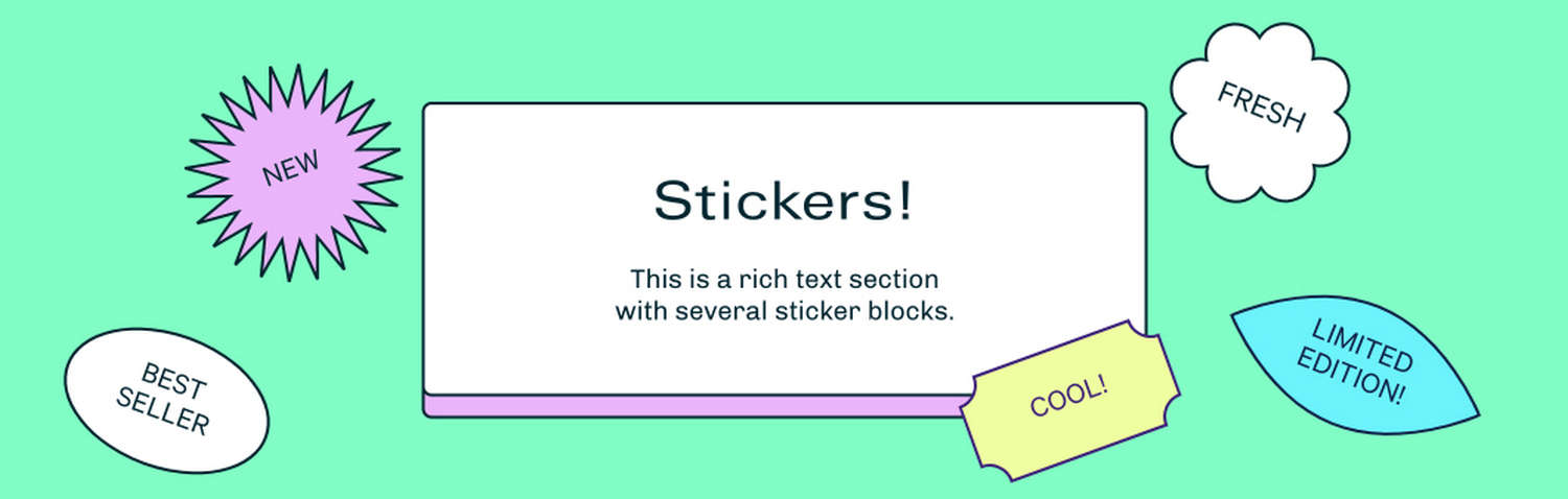
For example, in the following image, a Rich text section contains several Sticker blocks.
To add a Sticker block to a section:
In the Theme editor, select a supported section from the side menu.
Note
Sticker blocks can be added to most sections, but not all sections.
Select Add block, and then choose the Sticker block.
Types of sticker
Shapes theme provides more than 50 sticker types to use with a Sticker block. For a list of available sticker types, refer to Stickers.
Use an image as a sticker
You can upload an image to a sticker block.
The previous video demonstrates using an image as a sticker.
Note
If you upload an image, the sticker block's shape and text settings no longer apply, and are replaced by the image.
Use an image as a sticker:
In the Theme editor, from the side menu, select a section that contains a Sticker block.
Expand the section menu, and then select a Sticker block.
Use the Custom image > Image picker to select an image to display in the block. Refer to Add, replace or remove an image or video inside a section or block.
Configure a sticker
To configure a Sticker block:
In the Theme editor, from the side menu, select a section that contains a Sticker block.
Expand the section menu, and then select a Sticker block.
Apply a block setting described in the following table.
| Block setting name | Description |
|---|---|
| Sticker width | Adjust the Sticker width slider to set the width of the block between 100 and 300 pixels. |
| Half width on mobile | Use the Half width on mobile option to turn on or off "half width" mode. With this setting enabled, the block's sticker displays at half width on mobile devices. |
| Text | In the Text field, enter text to display in the block. To display the block's text across multiple lines, force a line break by adding an HTML line break <br> tag at the end of each new line of text in the Text field. |
| Shape | Use the Shape option to select a shape for the block to use. Refer to the previous image to view some of the available shapes. |
| Font size | Use the Font size option to specify a size for the block's text. The font size is scaled relative to the sticker's width. For best results, apply this setting after you set a sticker's text and shape. The options are Extra small, Small, Medium, Large, and Extra large. |
| Custom image > Image | Use the Image picker to select an image to display in the block. Refer to Add, replace or remove an image or video inside a section or block. When you upload an image, the block's text and shape are replaced by the image. |
| Position > Horizontal position | Adjust the Horizontal position slider between 0 and 100 to position the block along the x-axis (horizontally) inside the section. |
| Position > Vertical position | Adjust the Vertical position slider between 0 and 100 to position the block along the y-axis (vertically) inside the section. |
| Position > Rotate | Adjust the Rotate slider to rotate the block inside the section between -90 and 90 degrees. |
| Layout > Show sticker on mobile | Use the Show sticker on mobile option to show or hide the block on mobile display devices. |
| Layout > Show sticker on desktop | Use the Show sticker on desktop option to show or hide the block on desktop display devices. |
| Animation > Rotation | Use the Rotation options to configure an animation that rotates the block. The options are No rotation (default), Constantly rotate, or Rotate only when page is scrolling. |
| Animation > Enable parallax | Use the Enable parallax option to turn on or off a parallax animation effect. If you enable this option, the block's content scrolls faster than the rest of the page. |
| Animation > Parallax speed | Adjust the Parallax speed slider to set the speed for the parallax animation between 1 and 10. To use this option, turn on the Enable parallax option. |
| Color > Color scheme | Use the Color scheme picker to select a color scheme for the block. By default, the block uses the containing section's color scheme. Refer to Colors. |
| Color > Background color | Use the Background color option to specify a background color for the block. Set the block to use the section color scheme's Text, Accent 1, Accent 2, Card, Background, or Gradient color. |
| Remove block | Select Remove block to delete the block from the section. |